as_lajosmizse_ultimate
 CS
CS

as_lajosmizse_ultimate
by
Taylor
Posted 18 years ago2005-11-07 13:31:09 UTC •
Completed •
Counter-Strike
Loading...

- Name
- as_lajosmizse_ultimate
- By
-
 Taylor
 - Type
- Map
- Engine
- Goldsource
- Game
- Counter-Strike
- Category
- Completed
- Included
- BSP
- Created
- 18 years ago2005-11-07 13:31:09 UTC
- Updated
- 18 years ago2005-11-07 13:31:09 UTC
- Views
- 2769
- Downloads
- 853
- Comments
- 10
- Rating
- 3.00 (2)
- Reviews
- 0


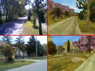
This is the third and last version of this map-but I decided not to upload the previous two, because they were a little bit "amateur" maps. As a matter of fact the first one was my first map that I ever made for HL or CS. This map is a part of the little town that I live in, thats why I made two pics of the real world next to the map pics. Well, the goal was to make my street as identical as possible (the first pic), the other one is not so perfect, I changed the reality a bit for better gameplay, and it would be hard to make it the same anyways...so my street the other parts are half real, half fantasy. The story is real simple, and a bit childish (it was just a crazy idea back then for my first map): escort the VIP to the bus stop! :)) The map arcitecture is not the best, I know, the round is over fast, but give it try, and write some comments please!
10 Comments
You must log in to post a comment. You can login or register a new account.
Nice Architecture throughout, except in a few places:
-scale is weird--too big or too small-- in places.
-suffering from some blockiness here and there.
-misc weird stuf like the shrubs that should have a level top.
Choice of textures is questionable in a few places, and some alignment issues. But overall the the texturing is quite respectable.
I didn't notice any sounds, sot that's a minus for ambience.
The sort of trees/bushes you used are only really good for background stuff imo, as you can see the 'panels' easily when there upclose. There nice enough and aligned perfectly, just in the wrong place imo. I would recommend models instead.
Overall a very interesting and pleasing map, which still needs some attention. Quite amazingly well done for a first map!
First, the lighting is boring. It's a sort of yellowish bleeding without real shadows, which makes all feel blending together too much.
Second, there's some area's that suddenly stop or where you suddenly clipped the player. Especially the player clipping feels odd and sometimes unnecessary. The sudden stop of roads is understandable as it's the HL engine we're talking about, but it does feel strange. Something to block sight would be nice.
Third, I believe you've restricted yourself too much to the place you recreated. Some of those backalleys and gardens were just dead-ends and I felt they didn't add anything to the gameplay. Only makes the map harder to learn and makes it feel put down together without too much thought.
Fourth, some things felt out of proportions. The Heineken sign, but also the trottoir heights and other edges and such felt often too big. Some things better fit smaller. This does not really count for the width of roads or generally 'paths', because narrow paths allow few players and little room to dive for cover so that may not be a good idea.
All in all, there's some nice things here but in general, the map didn't do it for me. I couldn't playtest though so I don't know how it plays, but it didn't really feel like it would play too well. Could use some work. Hey, talking about gameplay, David Johnston, creator of dust and dust2, has a blog where he often talks about gameplay issues. Check it out, it's worth a read.
**********************
+ Texturing. Overall texturing was ok, some of the textures didn't fit tho, but it looked quite good overall.
+/- Architecture. It was ok, but some areas questioned me. I didn't like the streets ending in mid air or being blocked by something unrealistic(those sandbags and containers), you could have made themend up realistically, like giving them a curve and adding a clip brush, blocking the player from seeing the end of the street or something. I also disliked those "walls" with the ground texture near the CT spawn, that could be changed with more trees with a clip brush. Some places looked too empty or lacked of realism (shoe store, bar, most of the buildings inside them) You also should work on the scale, like rowleybob and Captain P said.
*********************
- Layout. It's just 1 path to the escape zone. You really should make more alternate paths, like a sewer or something.
- Gameplay. It's be more T balanced, cause there is only one rioute to the ecsape zone.
*******************
-- Lighting. VERY BAD. It's fullbright. You must compile VIS to make it look more realistic cause now it's just SO ugly! D:
****************
Overall - a good map, it still needs lots of work, but if you get it right - it will really be a nice map to play. You should also do something bout the r_speeds. 1700-1800 isn't very good for a CS map.
Keep this up!
Anyway, I think allowing people up on the roofs isn't a real good idea here, as it gives them a really large view, plus the map is almost completely linear, so a few snipers simply block off the main and only route. It needs some alternative routes, like paths through the backyards. Oh, and hide the view from the skybox some more, as I already said, a sudden ending road looks fake.
Non-Source on the right
@Daubster: It isn't fullbright, this time vis and rad ran perfectly...it might look like it is, but it's not...I'll work on it!