Kitchen
 HL
HL

Loading...
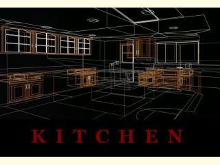


Minicompo entry for map a kitchen,
It's a replica with textures drawn straight from my kitchen.
It's a replica with textures drawn straight from my kitchen.
7 Comments
You must log in to post a comment. You can login or register a new account.
++Spectaularly brushed!
+Great Lighting
++Realistic Holy crap!
++Friggin' toaster shoots out toast!!1
+Vast majority of textures look great!
=Quite functional, but room for improvement(intersections and radius)
-no sounds really, but it wasn't what the compo was about
-no custom sky, same as above tho
When first loading up this map, I was simply blown away at how realistic and perfectly scaled everything is. Those wood textures for the cabinets really are beautiful, and the lighting is the icing on the cake for the pretty brushwork and textures. The toaster was also a nice addition.
I liked how everything opens, and you got the speed/sounds for the doors just right. However, some of the doors intersect with each other or the walls sometimes. To eliminate this, space the doors out a little and/or limit the swing radius of the func_rotating. If you wanted you could also make some of the drawers passable if they are troublesome hitting the player, but afaik the drawers worked great!
I loved all the textures--especially the "NO KITCHEN" one :)--except the one you chose for the steel of the counter rim, faucet, and toaster. Use a different metal texture--one that has some shiny marks on it like a glasss one--or scale it down a bit. I use generic027 from the HL1 wad for most of my metal stuff.
More doodads like the toaster would've been nice, and though the map is very interactive, you could have done more with the fridge and the sink to make them more so. Some sounds like the humming of the refrigerator, a ticking clock, microwave, would have made a little more 1337 than it already is. Same with a custom sky, but whatevs, none of this stuff is what the compo was about, but it adds to the immersion.
My only last complaint/nitpick is there was no mor food besides the toast! I was hoping to see a world brush turkey, but maybe next time
Anyhoo, superbly superb work! A perfect entry for the compo and well-deserving of 5 stars!
*****
I just realized all the cupboards/drawers were bare, and there were tons of props you could have added inside them. Also lots of stuff outside like a cookie jar among many other things!!1
I'm sure you're aware of this and the lack of props nonwithstanding, it's still a superb map and compo entry!
General pros and cons:
+Amazingly intricate brushwork
+Lots and lots of functioning drawers and cupboards
+Toaster wins at life
+Texturing
+/- Scaling was a tad too big. Shelves should only come up to maybe 6 inches above the waistline, not all the way up to your chest.
-Microwave and oven were extremely disappointing. Neither of them functioned and there was very little detail is the two.
-All the drawers were empty, a big downer
-The view from the window showed a flat backyard with a tree texture lining the edge, bleh.
--------------The kitchen just ends. You should have cut the edge off with some walls and a few doors, even if it doesn't match your home perfectly. But putting NOT THE KITCHEN all over the edge almost made me cry.
Other than that though, there's really no huge problems, just little improvements. It doesn't deserve five stars, in my opinion, but should be really good competition for the other entries (entry?), and I wouldn't be surprised if it won.
What you 4-star raters are forgetting is this map was constructed for a BRUSHWORK compo. In that capacity it's certainly worth 5 imo. Hell, It's so much more realistic than 75% of most HL maps, I'd give it 5 even it wasn't for a bruswork compo.
The textures could be improved, but it lookt superb for the whole imo.
And lastly, he could have made more stuff interactive and added more props, but we all know how it feels to get sick of working on something, and we don't finish it, or make it as good as it could be... c'mon people! This is also why I liked the "Not The Kitchen" texture, resembling CLIP or AAATrigger LOL! I like to use the "Missing Feature" texture on stuff I'm too lazy to find a texture for at that time!
Anyway, I've said my piece, and this map doesn't need my defending it anyway... it rocks!
Not The kitchen resemblesthe hallway to the other rooms and my living room.
I know i could've done a lot more (and i was planning to) but nobody else was entering and i just finished what i was working on ATM (the cabnetry)
The backyard is just sopossed to give you a sense of being. Like an ambiance not achieved with sound. I live in a residential area surrounded by trees. I know its not vm'd (some of it is. there are hills leading to the trees !!omgosh!!) but once again. that aint part of the kitchen.
As for the scale, everybody knows that a wall is 128 units high so i based it off that. It just sucks that freeman looks thru his abdomen and not his eyes; like he should.
Thanks for the commentary, and if 4 people should enter, or plan on entering then i will definitly add more detail. I just lost the drive to continue after everyone decided they didnt want to participate in the compo.