DM-TheBadPlace
 HLDM
HLDM

DM-TheBadPlace
by
scrama
Posted 17 years ago2007-02-05 02:27:23 UTC •
Completed •
Half-Life: Deathmatch
Loading...


- Name
- DM-TheBadPlace
- By
-
 scrama
 - Type
- Map
- Engine
- Goldsource
- Game
- Half-Life: Deathmatch
- Category
- Completed
- Included
- BSP
- Created
- 17 years ago2007-02-05 02:27:23 UTC
- Updated
- 16 years ago2007-08-09 23:54:24 UTC
- Views
- 4299
- Downloads
- 1097
- Comments
- 12
- Rating
- 4.50 (2)
- Reviews
- 0


Scrama returns!
Map: DM-TheBadPlace
Game/mod - type: Half-life - deathmatch map
Version: 1
Author: Scrama
Drawtime: i can't say...
Custom textures, custom sprites.
No custom sky, no detailtextures, but it will.
This map is remake for Quake DM map dm4 The Bad Place.
Thanx to BUzer for comments and advices on texturing and lightning. UPD: Well, I've updated my map and can show it to you.
I've added custom sky and detail textures, remade doorway blocks, changed weapon layout and fixed some texturing bugs.
Map became larger, then 2 mb, so i have uploaded it on webfile.ru. If you need you can ask me for uploading on other server.
Have a nice matches and... sorry for my english.
12 Comments
You must log in to post a comment. You can login or register a new account.
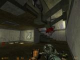
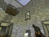
However, the way it's all put together doesn't really work. Even if the textures are nice, the stay mostly the same throughout the whole map. Since lighting is also always in the same range of colours, it's really hard to distinguish one part of the map from another. It would also make the map boring to play after a couple of minutes. Think of it as "visual fatigue".
Navigation works in terms of how it's built on a smaller scale (stairs etc), but the layout seems really messy. The frequent use of teleports makes little sense and adds to the confusion. Unless you appear in the central room, of course.
I haven't played the original map, so these problems might not be entirely your fault.
The map looks quite nice, even tho I think this map would be madness to play with 3 players or more, small hallways are annoying.
I also found a RPG, this powerfull weapon should always be avoided in small size maps imho.
When I walked trough the map a few times, I remember this map.
It's one of the official maps in DMC!!
Only different textures and obviously completely rebuild.
I couldn't remember this map in Quake, but heh, I only have Quake 3: Arena.
(Btw, those rocks looked fucking awesome!! I'm impressed.)
Something I really liked was how you smoothed out the whole map, so there was never a place where you could get hung up on detail brushwork. This is great, since it's such a tiny map, and the halls are so small. I think it leads to faster paced gameplay, because you don't have to worry about avoiding walls.
You also used plenty of ambience, and there was never a spot that felt really empty. I noticed, however, that you didn't use any sounds for the teleporters. It seemed pretty weird just walking into one and suddenly popping up in another area, without any feeling that you had just activated it.
The biggest complaint I have about it is that it's a bit repetitive in places, and I noticed quite a few of the details had been copied around, like that teleporter thing. There were also a lot of halls that looked really similar, and very few unique landmarks, which made navigation kind of difficult.
Great job, though.
Quake is realy old game - so I don't confused with you never seen it. I made cracks on the walls to separate places, but it is not answer... Okay, I try another way in my next release. And I will use sounds for teleportation at your notice.
Did somebody likes my living plants? )
Err... Could you repeat that? I'm not sure I quite understand...
And the "living plants"... Not sure I saw those.
Ok, I will go to the bookshop tomorrow and try to study english. Do you want to study russian, guys?
Nevermaind, my hands and brains working and i can maping and submit maps in silence.
That said, I love everything about this map anyway, except a few small nitpicky things:
-The squarish doorways and hall spaces make the rest of your beautiful, curvacious-detailing look sorta bad. Same goes for the blocky main stairs, and some of the square trim around the pillars and some walkways.
-some of those squarish blocky things might look better with different textures.
The good:
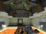
++Great detailing! the "v" thinigies, the walk-out vista, broken stuff, the portals, and some nice general detailing--that was sort of distraced from by the previously mentioned blocky stuff.
+Some great custom textures
+Nice tight, varied layout.
+ I like that you can go back and forth through the portals, and you're not just teleported to some random location.
Anyway, it's a great map, and I'd love to see how it plays! Maybe MuzzleFlash will put it on the TWHL HLDM server!
1.Some really good architecture in the map.
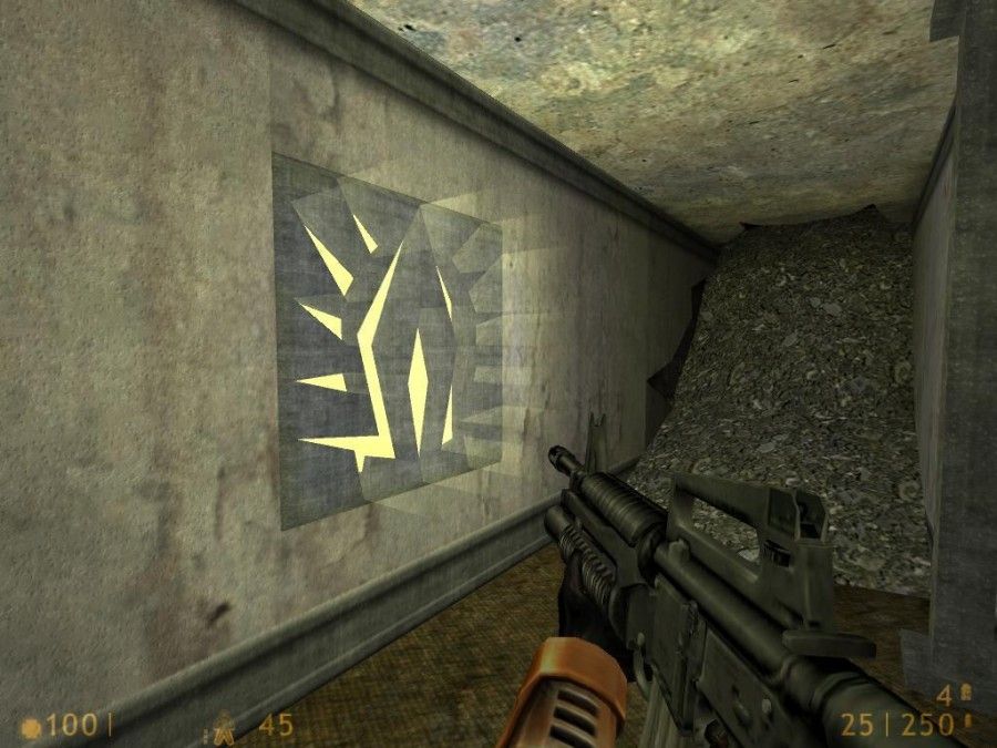
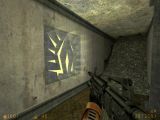
2.I liked how you had those Symbol things haveing a sort of glow.
3.Lighting was nice as areas werent to dark or light.
4.The portals were sort of cool, but you could keep walking backwards into them and you would just keeping getting transported which I guess would confuse people.
Overall this was a nice looking DM map, im not much on them but it seemed really good for probably a 6 person match. 5*'s