Warzone
 HL2
HL2

Loading...


This is an old map i had made for the starting of a hl2 mod me and azoth72 were going to make. However, school got in the way and Azoth wasnt able to keep up with mapping because he had all advanced classes :(. But after i realized this mod was probably not going to happen, i decided i would turn this map into something of my own because i really like it. But after several redoings of this map im not sure where to go, and im probably going to start over on this map. But i would still like opinions on this map.
6 Comments
You must log in to post a comment. You can login or register a new account.
It's obvious that you know how to put entities together, and there's a couple of bits of neat brushwork that hint that you have more ability than the screenshot above shows.
The reflections are completely off everywhere, and you need to sort them out. Cubemaps, man.
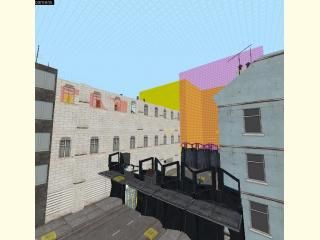
The longish corridor outside the starting room, with the mostly locked doors, is too repetitive and having all those combine locks so close together on every door only adds to this repetitive-ness. Subtle variety is the key to making such areas look pleasing. Also, the lighting is way off here. It's ugly -- and where is it even coming from?
You've used too many of the sexy looking combine shields outside, and the fps really suffers when looking at them all in the street. You'd get a better overall result from getting rid of most of them, and use the large amount of resources you're currently spending on them to add a whole shed full of detail brushwork and other entities. There are many effects you can employ which look nice but don't hog your resources like those funky translucent shields tend to.
Also - you're drawing the shields most of the time. Have you noticed how your fps fluctuates wildly when you walk down the staircase? Or even when you turn around on the spot somewhere? Here's why. Observe this screenshot -
http://img34.imagevenue.com/img.php?image=65860_warzone0000_122_711lo.jpg
(In case you've not seen it before, that's wireframe mode, which is dead useful for testing how the engine is dealing with visibility in your maps)
That screenshot was taken when I was standing inside, halfway down the staircase, looking at the wall. As you can see, the engine thinks that the player can still see outside, even though he definately can't. This is bad, because the engine is still drawing all of the area outside, and everything in it. Often,this won't matter tooooo much, but here you have a crushing amount of complex models being drawn uselessly, and a lot of the time. If you can't fix this with hint brushes (it might be tricky to do so now), try an occluder or two, with triggers to turn them on and off depending on where the player is. I saved a bucketload of fps on a recent map by doing this kind of thing. Just don't leave occluders activated all the time - they suck up resources themselves.
Or just get rid of some of the models, of course
The texturing in general needs work, although there's a couple of bits where it's passable. I can't decide if the walls in the cafe area downstairs were made that way on purpose, or if it was just how it turned out when you made it. Either way, they're the best looking walls in the map. The cafe though, feels VERY empty, and once again the lighting is explained poorly - two bathroom style lights stuck to the ceiling in seemingly random places...hmm. Fix that, and fill up a bit more of the floor space - and put some stuff on the walls. At least some decals! The doorway to outside is rather bland too. Put some trim on it.
Overall, well, in it's current state I wouldn't be anywhere near happy with it if it was my map. But I keep looking at it and seeing that it's not all bad -- there's definately potential here, and I'd like to see you improve it a bit, and hopefully stick some kind of story and gameplay in there.
First thing to do, put a few cubemaps at player-head height down the length of that corridor. After you compile it with the cubemaps present, type 'buildcubemaps' in the console (in-game) and just look at the difference it will make to the corridor.
Good singleplayer maps are far too rare.
So keep working on it!