fy_reflective
 CS
CS

Loading...

- Name
- fy_reflective
- By
-
 Striker
 - Type
- Map
- Engine
- Goldsource
- Game
- Counter-Strike
- Category
- Completed
- Included
- BSP
- Created
- 16 years ago2007-09-29 16:23:11 UTC
- Updated
- 15 years ago2008-10-19 06:21:18 UTC
- Views
- 2625
- Downloads
- 754
- Comments
- 6
- Rating
- 2.50 (2)
- Reviews
- 0


A small 10 players map.Hope you'd like it. Have fun.
6 Comments
You must log in to post a comment. You can login or register a new account.
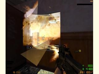
The reflective floor is a nice try, and 'makes' the map because without it things would look very boring. It shows that you have at least put some thought into how to make the map look better and more unique.
However, I think the floor is a bit too transparent, and it actually looks like what it is - a room underneath. Also - the blue lights on the ceiling don't match up with the ones down below -- in fact I'm sure there is one extra light in the 'reflection'....
Also, when you break the windows, they don't break in the 'reflection'. I can't remember if you can actually fix this in GoldSrc, but if you can, you should.
The scale is a bit wrong in places. Such as the sofa and the filing cabinets in the middle of the walls of each side -- they're far too big when compared to the other desks and bookcases, so they look strange.
I've seen worse lighting --- but the lighting here could still be better too. I realise that lighting a small FY map like this requires some attention (so you don't unbalance the teams chances) but if you want a map which looks really good, then you must get some contrast and variety in the lighting.
There are a couple of badly aligned textures, and some which look horribly stretched too.
It's very small - even for an FY map. It's basically one room. (Well two, if you count the reflection) I can't see 10 people staying on this map for hours.....
It's only worth two stars I'm afraid.
But two stars is an entire world better than one star
Keep practising. You've got some potential.
But that.....with the reflection...I've played with a couple of guys cstrike and then asked them: Do you like the reflection? They "yes" After 10 minutes I told them that ,in fact there isn't any reflection,the floor is a kind of glass and the reflection is just the room turned up side down.The day to day normal players won't even notice something.As for us,we know the floor isn't a reflection and that's why you saw so many things playbus.
I'll make the rooms bigger somehow and put some working vending machines(not just some cubes with vending texture).A stupid thing that affects the map quality is when a person is shot,after a few seconds it's corpse falls through the floor !!! :)) well nobody told me something but ,oh well......
Should I put some outdoors?? For example: Tero starts in office and counters are on an alley.And they enter a block of flats bla bla bla.What do you think?
In the end it's good -- even someone who understands the illusion will be impressed by it if it is good enough - so if you impress us mappers with a reflective floor in GoldSrc, then the average player is going to shit themselves in delight when they see it. This is something I recommend you aim for, if you want to progress to making truly great maps. Exceed expectations. Surprise people.
If you made the floor a bit less transparent, and lined up the lights on the ceiling, it would be a very good reflection. It's just at the minute, the floor actually does look non-solid.
In reality, a floor would have to be VERY shiny, almost like a mirror, to have a reflection as clear as the one in this map. And the texture you have on the floor does not lend itself to appearing THAT reflective. Make it more subtle. Make it so the reflection is still there --- but you can't quite see it clearly. Make the floor look pretty solid, even though it's not. It will look much more realistic.
Expanding the map could be good. But if it was me, I'd start again. Come up with a plan before you start, and try to stick to it.
Outdoor areas are nice, and you should definately think about making some in the future for your maps. Be warned however, that outdoor areas are much more difficult to make look realistic and pretty.