Alpha4th

Half-Life: Deathmatch HLDM
Alpha4th by 4N!M4T0R
Posted 14 years ago2009-07-29 09:11:40 UTC • Completed • Half-Life: Deathmatch
Loading...
Screenshot Thumbnail
Name
Alpha4th
By
4N!M4T0R 4N!M4T0R
Type
Map
Engine
Goldsource
Game
Half-Life: Deathmatch
Category
Completed
Included
BSP
Created
14 years ago2009-07-29 09:11:40 UTC
Updated
14 years ago2009-07-29 10:45:28 UTC
Views
3013
Downloads
625
Comments
6
Rating
2.00 (1)
Reviews
0
full star full star empty star empty star empty star Download (1.02mb)

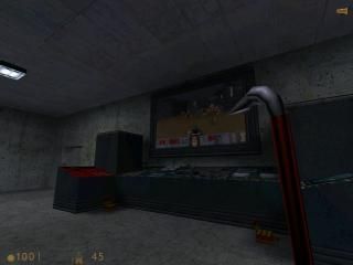
It is typical Half-Life Deathmach map.
Completed within one week.
Made by 4N!M4T0R.

Special Thanks
Valve for VHE and Half-Life.
Half-Life.lt server for testing beta version.
Daubster - Help & suggestions.

6 Comments

Commented 14 years ago2009-07-29 10:09:40 UTC Comment #8398
what is it
your description lacks content.
Commented 14 years ago2009-07-29 10:25:43 UTC Comment #8393
Edited.
Commented 14 years ago2009-07-29 13:49:01 UTC Comment #8396
The map looks like it would be pretty fun but has a few things that could have been different. The halls and rooms are all huge with not that much stuff in them. Lighting imo is either too bright in some areas or just too dark "pitch black". The textures are kinda boring and the map lacks any ambience. The weapon placement is alright but you could probably add more. The big room with the rpg is pretty cool looking but like every other room, its just a big one with boxes in it. You definitly have what it takes to make a fun deathmatch map but take what ive said into consideration for your next map. Put more detail into your hallways. Don't light everything super bright. Don't limit yourself of bland textures. Use different colored lighting. Build more rooms that arent just squared. Either way this map pobably would be kinda fun.
Commented 14 years ago2009-08-02 19:52:02 UTC Comment #6412
Well, it's functional but there is plenty of room for improvement. To be honest, it's very underwhelming.

+Warehouse boxes looked nice
+Very large map
-No sounds
-No interactivity
Incredibly boxy and empty in most areas- Try working on your corridor architecture for the future.
-Awful choice of textures
-All lights were white
-All lights were point lights
Commented 14 years ago2009-08-03 18:28:43 UTC Comment #17696
Thanks for coments.
Commented 14 years ago2009-08-05 21:30:09 UTC Comment #5707
Look into texture lighting for the future. They look much better than point lights in most cases.
Tutorial here: http://twhl.co.za/tutorial.php?id=54

You must log in to post a comment. You can login or register a new account.