St_Chopa
 CS
CS

Loading...

- Name
- St_Chopa
- By
-
 Sir Red
 - Type
- Map
- Engine
- Goldsource
- Game
- Counter-Strike
- Category
- Completed
- Included
- BSP
- Created
- 10 years ago2013-09-27 16:52:20 UTC
- Updated
- 10 years ago2013-09-27 16:52:20 UTC
- Views
- 1495
- Downloads
- 481
- Comments
- 4
- Rating
- 3.00 (1)
- Reviews
- 0


pew pew
4 Comments
You must log in to post a comment. You can login or register a new account.
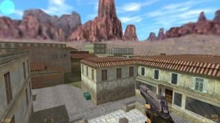
You show very good skills of architecture and layout( I can't pronounce very well on this aspect as I haven't had the opportunity to play). There are some spots here and there that I felt were in vain( like a pantry and a bookstore window where the chamber was empty. I like that the two bases have some defining characteristics, such as the good looking glass windows from the office building at the T base, and the statue plaza at the CT base.
Your brushwork shows attention to detail, as I have discovered some stairs with a layer of seemingly 1-unit thick brushes just for detailng( also present in the "plaza" place).
Let me start on the negative aspects.
This map is void of sounds. Even if the map shows nice architecture, I feel a bit confused as to where I am. Clearly it's an italian-like town, but having no sounds makes the map less credible.
Worst of all, lighting. That's why I said it's peculiar. Were you in a rush and decided to compile on -fast? I see no reason... One example that comes to mind is the depot-room( also with a bit weirdly placed conveyor that seems to be working, but the texture is static and again- no sound!).
First I notice it's really dark in there. I mean, there are some places where it's complete blackness. A second later I notice that the light comes from nowhere...
In the office buildings and some air-ducts the lighting is just absent, and this is not good at all. It hurts gameplay. In the air-ducts you could always try to put a more interesting light like reddish, blue or something.
Also you tried to use some spotlights, but they look really odd: try to increase its Outer(fading)angle.
Overall, its a pretty complete map, but you definitely need to improve your lighting. Also, some sound ambiance would be a nice touch.
Architecture: 75%
Texturing: 75%
Ambience: 60%
Lighting: 40%
Gameplay: 80%
Total: 66%
That's a 3.3 star-rating. Improving the lighting would boost this to 4 stars ;).
edit
I really like what you have done so far, i will be watching for updates! (also found a Red book, but it wouldn't open for me) ='(