Commented 14 years ago2010-09-25 01:06:01 UTCComment #18557
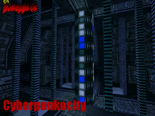
Real nice map! I appreciate the Cyberpunk theme a lot, architeture is great, specially on the hallways, one of my favorite areas was the cargo-area, altough, the textures for those crates could be different, and some areas could have more pick-ups.
I like it, reminds me a lot of Perfect Dark, but it could be more detailed, maybe some doors, more pickups and a few additional brushes would do the job.
You got 3 out of 5! Seems to have a nice and intense gameplay!
Commented 14 years ago2010-09-25 03:27:10 UTCComment #18558
Joebama, don't you think it's about time to stop mapping for hldm? I meen in all seriousness, people don't play it anymore. Maybe you should try mapping for svencoop or hl1sp, make a series of maps or a mod maybe? People play those more, plus it will be a nice change for once from the boring dm spam. It looks like you have a lot of time on your hands anyway.
Commented 14 years ago2010-09-25 04:31:17 UTCComment #18559
Skals, even with popular games, the likelihood that any custom multiplayer map is ever going to be played by anybody other than the author and maybe a few of his friends is, let's face it, small at best. It usually takes well known authors or some force of God for them to end up on servers that anybody plays. The number of custom multiplayer maps being made, compared to the number of them that are ever played, is hugely disproportionate. It's just really difficult for them to get any kind of exposure unless you're the one running the server, and even then it takes a person who wants to join and wait for your map to download, and then wait for other people to join.
It's ridiculous, so I say map for whatever damn multiplayer game you want. Chances are it's never going to really be "used" (unless you count one person running around looking at stuff.)
Commented 14 years ago2010-09-25 13:38:42 UTCComment #18562
Well, I atleast took the time to check it out. The rotating television tower is quite a neat idea, so are the different dispensers, but the rest I feel is lacking. I can't point out what exactly it is, but I do think you could have tuned the lightning better. On note of those dispensers by the way; when they are empty the light activates. It should be the other way around, for now it just makes no sense. Otherwise, it's a clean looking map with a interesting theme. Once again, however, the main critique is the gameplay. Weapon placement simply makes no sense. Not only is ammo extremely easy to refund, but the map packs only the powerfull of powerfull and sometimes that just doesn't work. The map has too little of scale for any use in gaussjumping and I wouldn't say the RPG makes sense either. Another thing I highly object for the sake of HLDM (..and back 'n in the days I played lots, so I'm really just talking from a gamers perspective in this one) is dead ends. Don't you ever do that again. There is a reason why that lambda map from valve never got played. In effort I give you a 3.
Commented 14 years ago2010-09-26 10:23:49 UTCComment #18570
A lot of parts from this map were recycled from another map of mine that I made for a competition.
Never got finished. But, that's where most of this map came from. I agree about the dead ends part, but than again it's based off of an older map and a map called "Stranded" with an airlock system.
I like it, reminds me a lot of Perfect Dark, but it could be more detailed, maybe some doors, more pickups and a few additional brushes would do the job.
You got 3 out of 5! Seems to have a nice and intense gameplay!
PS: I like those Duke Nukem references!
It's ridiculous, so I say map for whatever damn multiplayer game you want. Chances are it's never going to really be "used" (unless you count one person running around looking at stuff.)
Never got finished. But, that's where most of this map came from. I agree about the dead ends part, but than again it's based off of an older map and a map called "Stranded" with an airlock system.