Competition: Texture It, Light It, Play It
Closed
View Results
- Open Date
- 22 years ago2003-01-25 00:00:00 UTC
- Close Date
- 22 years ago2003-02-08 23:59:59 UTC
- Type
- Map from Base
- Allowed Engines
- Goldsource
- Judging Type
- Judged (all engines combined)
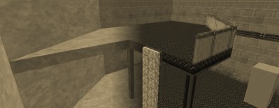
Here's a task that'll test your raw creative ability: you're provided with an excruciatingly sad-looking map and one light fixture. You need to bring this room to life by texturing it and carefully placing the lights. There's nothing more you need to do. Use your imagination. Create atmosphere! By the way, the winner's map may be used as the base for a future contest! (with consent, of course).
Download the base map here.
Download the base map here.
Results
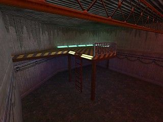
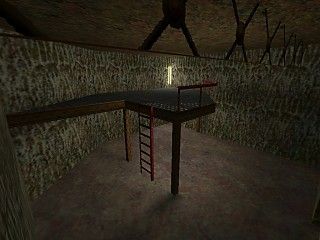
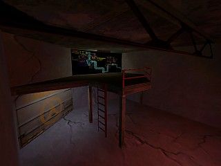
Another tough decision (I have a feeling that's how it's always going to be)... but of course one had to be made. I went through all the entries and thought each one was a great effort, so anyone who didn't make it to the top 3, don't be disappointed! Here are the other entries:
LightForce's, Mastermind's, Another mattyb map, Another mattyb map, Another SlayerA map.
The maps varied in pretty much every way possible given the restrictions: some were bright, some shadowy, some under warm light, others under cold. And of course texturing styles: although the base map suggested concrete, some interesting variation was achieved. The three winners show off some of that variation.


