Competition: Re-Invent a CS Classic
Closed
View Results
- Open Date
- 12 years ago2011-12-16 00:00:00 UTC
- Close Date
- 12 years ago2012-02-20 23:59:59 UTC
- Type
- Full Map
- Allowed Engines
- Goldsource, Source
- Judging Type
- Judged (all engines combined)
- Judges
Naturally, this calls for a Counter-Strike mapping competition. The rules are as follows:
• Pick your favourite official CS map with a distinct visual theme/atmosphere that never worked too well gameplay-wise. Good examples would be chateau, havana, italy, 747, tundra, rotterdam, etc.
• Make a new and improved map that plays well, based on your chosen theme.
Submissions will be judged mainly on how well you have managed to re-create/build on the original theme & atmosphere, however improving the gameplay is also a huge plus.
Visit the official thread for any questions.
GL & HF!
Results
Judged By:
 Daubster
•
Daubster
•
 Archie
Wow, what a turnout. This was extremely hard to judge, not only due to gameplay being a factor, but also because of the awesome quality of the submissions we've received. While the first two winners were somewhat clear enough, at least 3 entries were extremely close for third place. A huge thanks to all the entrants, to the folks who helped us playtest, and finally to Chet Faliszek and Marc Laidlaw from Valve, who kindly helped us arrange the beta keys!
Sorry for the wait, and congratulations to the winners! Enjoy the CS:GO beta!
Sorry for the wait, and congratulations to the winners! Enjoy the CS:GO beta!

Archie
Despite its reliance on Condition Zero – a game whose players are a rarer sight than Big Foot – I instantly fell in love with this utterly charming and inventive re-imagining of the de_dust theme. Dust has been remade more times than I can count, but never with so much originality and willingness to try different things. It's instantly recognisable as Dust, and yet at the same time feels completely new. The brushwork and texturing is superb and there are only a few small areas where the time constraint of the competition looks like it had any negative effect on the map.
Because it was made for CZ, we couldn't find enough players to properly test gameplay and it didn't come with a nav mesh which made testing with bots a chore, but this is still a magnificent example of mapping to a brief and is absolutely worth checking out. I heartily recommend Zeeba-G re-release this for a more popular game so that more people can try it!
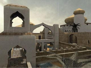
Daubster
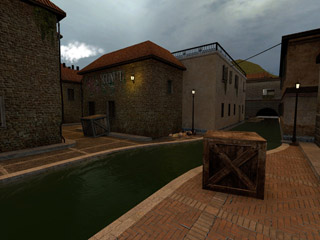
I can just imagine zeeba-G going "CHALLENGE ACCEPTED" as soon as we part-jokingly said that dust remakes weren't allowed. His immense mapping skills really show in this entry. Everything seems to have been constructed with the utmost meticulousness, from the gorgeous complex Arabic architecture, to the precise texturing & rich ambience. The original theme was captured brilliantly, and the addition of waterfalls, canals & some plants gave the map a lot more life, making it stand out from the rest of the dust remakes. The only thing missing for me were the signature chemical crates in the bombsites. A nitpick, but I feel they would have really driven home the fact that the map was based on dust.
As for gameplay, the new layout seemed to have been very well thought-out, catering for a variety of play styles, as well as featuring plenty of vertical combat.
Overall, a truly superb entry that somehow managed to make dust feel interesting again. Well done!
And yes, we gave first place to a dust map. Also Elvis is alive. And he's touring with the Loch
Ness Monster..
Despite its reliance on Condition Zero – a game whose players are a rarer sight than Big Foot – I instantly fell in love with this utterly charming and inventive re-imagining of the de_dust theme. Dust has been remade more times than I can count, but never with so much originality and willingness to try different things. It's instantly recognisable as Dust, and yet at the same time feels completely new. The brushwork and texturing is superb and there are only a few small areas where the time constraint of the competition looks like it had any negative effect on the map.
Because it was made for CZ, we couldn't find enough players to properly test gameplay and it didn't come with a nav mesh which made testing with bots a chore, but this is still a magnificent example of mapping to a brief and is absolutely worth checking out. I heartily recommend Zeeba-G re-release this for a more popular game so that more people can try it!
Daubster
I can just imagine zeeba-G going "CHALLENGE ACCEPTED" as soon as we part-jokingly said that dust remakes weren't allowed. His immense mapping skills really show in this entry. Everything seems to have been constructed with the utmost meticulousness, from the gorgeous complex Arabic architecture, to the precise texturing & rich ambience. The original theme was captured brilliantly, and the addition of waterfalls, canals & some plants gave the map a lot more life, making it stand out from the rest of the dust remakes. The only thing missing for me were the signature chemical crates in the bombsites. A nitpick, but I feel they would have really driven home the fact that the map was based on dust.
As for gameplay, the new layout seemed to have been very well thought-out, catering for a variety of play styles, as well as featuring plenty of vertical combat.
Overall, a truly superb entry that somehow managed to make dust feel interesting again. Well done!
And yes, we gave first place to a dust map. Also Elvis is alive. And he's touring with the Loch
Ness Monster..

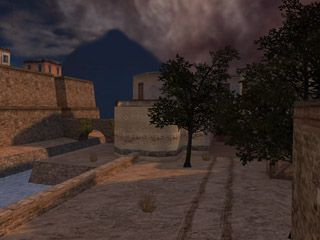
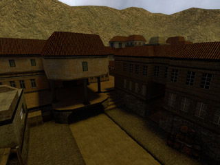
Archie
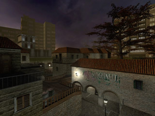
This stunning map is an absolute pleasure to explore and has an immaculately believable setting as well as a hauntingly familiar feeling to anyone who ever played cs_backalley, the classic map RabidMonkey decided to emulate.
It feels like it was constructed with half a year of painstaking care rather than the actual month and a half or so spent on it.
There was a lot of pain in not letting this take the first-place prize, but unfortunately after thorough playtests an awful lot of niggles and annoyances really started to show their ugly heads. There is an awful lot of layout crammed into a small space and this makes learning the map extremely difficult. We played for over an hour and I still didn't always know exactly where I was going. Also, there are loads of small physics props that aren't set to debris, so they trip up players and generally get in the way to an unbelievably annoying extent. The colour correction, too, is mental and it really felt like Terrorists had an unfair advantage overall. I love this map, but only as an art piece.
Daubster
Visually, this was probably the most impressive entry of them all. RabidMonkey displayed an almost obsessive attention for detail, creating a beautiful and incredibly vivid environment. The brushwork & texturing were top-notch and there was not a single nook or cranny in the map that hadn't been fitted with the right props or ambience. The cs_backalley feel was there too, with some great ambience, and a good amount of vertical combat. The general building design was absolutely spot-on with a lot of variety in both the facades and the interiors, significantly improving on the original in that regard.
However, when it comes to gameplay, this map just didn't click. I liked the variety in the layout, however it proved to be far too complex during playtesting, even with the help of a properly designed radar overlay. Some sort of directions on the walls like ones you usually see in defuse maps would have helped a lot.
On the bright side, much like in backalley (which was an absolute maze), the complexity of the layout would offer some fairly interesting encounters every now and then. Sadly, those were mostly overshadowed by long rounds where the remaining few players would spend ages just trying to find each other or the objectives.

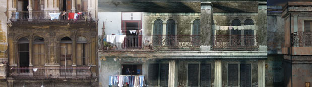
Archie
Atmosphere and dedication to the cs_havana theme are paramount here, with the map feeling like it's part of a much larger, real place. And I mean much larger, partly because everything in the map seems to be bizarrely large from stairs to doors to windows to barrels, everything makes the player look about 4ft tall by comparison. The layout is also fairly uninspired and doesn't provide much variety in terms of tactics or, to be honest, fun.
Out of the Goldsource entries, this one feels the most traditional. It's extremely faithful to the theme and has bucket-loads of character which is why it scrapes third place, but for me it just feels too stale to qualify higher.
Daubster
"Cuba te llama, Oye la musica!"
Me & Archie seemed to disagree over this one the most. I have to admit I am somewhat biased towards maps with great atmosphere, and holy crap did this one pull it off! In contrast to the completely silent original cs_havana, de_revolution had an incredibly rich & balanced soundscape with both static ambient sounds as well as randomly triggered ones. Coupled with the well-chosen dusky lighting, it created a wonderfully pleasant environment to play in. Gameplay also seemed to be fairly balanced with my only issue being that bombsite A felt a little bit cramped compared to B. The theme was captured fairly well with the blinds, vines, and various Cuban attributes throughout the map. The one thing missing was the strong touch of destruction/decay that the original featured prominently.
The overall level of detail was fairly high (considering the attention to performance) with lots of eye candy & some very nice scenery, however the general looks were brought down by the scale being too large with lots of huge props/doorways/buildings in most areas.
Still, all flaws considered, this was one of the most pleasant-feeling maps I've played in a long while. That had to earn it a trophy in my book.
de_lotus – Tetsu0
Archie
This was very close to getting third place; purely because of how much of a blast it was to play. The layout promoted some really creative play-styles and it felt like every round I was trying something new.
Where it falls short, though, is just how much it feels like it was pinched by the time constraints. It feels empty and soulless – two words that the original cs_italy laughs in the face of. It didn't even have the soprano music.
Daubster
Tetsu0 was really on to something when he designed the layout for de_lotus. It was by far the most fun entry gameplay-wise with great flow that provided some fast-paced & intense rounds. It probably took as little as two-three rounds for everyone to get the hang of the map, which was very impressive.
Sadly, the visuals were a lot weaker compared to the winning entries, and while there were some key italy elements in there (the wine cellar & market), the atmosphere that played such a big role in the original was rather bland. As Archie said, overall it feels like the time constraints caused this map fall just short of a trophy.
cs_italy_mc32 – Moaby
Archie
Like Tetsu0's Italy entry, this too felt like it was unfinished due to the time limit. It was really lacking in detail and the layout had some very odd planning as well. A whole area of the map only got footfall on about 3 rounds of the 20-minute game. There was also a serious bottlenecking issue which allowed Ts to lock down advancing CTs then get behind them to flank with ease. It was like puppies in a blender.
Many of the classic Italy areas were a lot more recognisable here than in de_lotus, but the gameplay and lack of detail really sunk this one.
Daubster
This entry was overall more visually appealing than Tetsu0's featuring more detailed architecture and somewhat better atmosphere. The theme was captured well with plenty of variety in the building architecture and some very nice flora. My only problem was that some key italy locations such as the wine cellar ended up being overlooked. Also the skybox looked really odd with the soviet apartment blocks not fitting the environment at all. Also much like in de_lotus, the ambience was fairly weak compared to the original. The map was fairly well-lit with bright street lights creating some nice contrast in the dark dusk environment, however some variation in the light sources and their color would have really helped.
Also while it's evident that the layout was designed with the best intentions, featuring plenty of interesting flank routes, it just didn't seem to work too well in the end, with some oddly designed chokepoints turning certain areas into an imbalanced slaughterhouse.
In the end, this was really close to 3rd, but the weak ambience and the gameplay dragged it down.
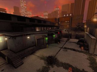
De_747 – Captain Terror
Archie
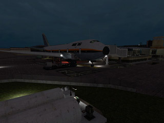
From far away this looks like one of the coolest and best designed maps ever. Just for god's sake don't play it!
I feel terrible for saying this, because I absolutely love the cs_747 theme and the ambition it took to attempt to recreate that, but up close this just looks so blocky and plays even worse than the original map it was based on. So many questions – why can Ts reach the bombsite before CTs? Why can you snipe the opposing team from spawn? Why do doors break – and even then, only one per set of doors?
And the sound? Good grief putting up with that for a 20 minute game was the most difficult thing I had to do as a judge. I think ZombieLoffe actually went insane and murdered his entire town after playing this because of the plane sound.
Daubster
While I respect Captain Terror for attempting to remake one of the most architecturally complex 1.6 maps in Source, it just didn't end up working too well as a whole. The exterior brushwork of the plane is definitely impressive, but it really goes downhill as soon as you go inside of it. The same rule seems to apply to the buildings too, as there's plenty of texture alignment issues and a general lack of finer detail throughout the interiors.
However the biggest issue with this entry is the gameplay. Terrorists have a huge advantage over the CTs due to a lack of effective flank routes and the positioning of the bombsites. Ambience can also get very annoying with deafening randomly triggered jet sounds destroying your eardrums.
Still, the little gags such as the MCPOKER intro or the smoking room were a nice touch. They make it feel as if the map acknowledges its flaws and doesn't take itself too seriously because of that. Regardless of its problems, de_747 is definitely worth checking out, and Captain Terror should be commended for embarking on something as ambitious for a 2-month project.
c32_legitzkrieg – Blitzkrieg
Archie
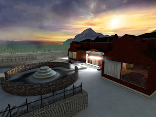
I'm really not sure where to start with this one. It's like the environment and the actual playable map were designed by two different people, one of whom was blind. There were more peculiar design decisions in this than there were in Windows ME and the scale and ungrounded reality of the setting were just bonkers. Gameplay also really suffered, with some odd invisible walls and the ability for Ts to get behind CTs far too easily around the side of the house. Also, why were the stairs made of snow?
Daubster
This one was essentially meant to be a cross between cs_estate and de_survivor, and while that is somewhat evident, the final result leaves a lot to be desired. The scenery is pretty nice, and there's even a crashed plane! However the survivor theme wasn't captured effectively enough with unique elements such as the ONLY CRATE IN THE MAP, the ice crystals, ravines & caves, and the frozen river ending up being overlooked. The house felt inconsistent as well with some odd texturing choices. As for gameplay, the layout is pretty much the same as in cs_estate, only without the basement flanking route, giving the terrorists a huge advantage.
Overall, a pretty strange entry, however considering it was Blitzkrieg's second released map, he is definitely improving.
de_torn – Lajron
Archie
The purpose of the competition seemed to have been somewhat missed by Lajron, as rather than taking the theme of de_torn and applying it to a new map, this just seems to be a rehash of de_torn, layout and all.
It's not bad at all, although it's quite blocky and empty, but the lighting was really glitchy and the skybox is... odd.
Regardless, it was quite fun to play, but as it's not an original layout, there isn't much to be said for that.
Daubster
We felt this deserved a special mention in the results, even though it was submitted a week behind the deadline, and thus technically wasn't included in the competition judging.
It feels a lot like a slightly simplified copy of the original de_torn with few improvements or changes. The visuals were mostly lacking with a lot of default Source content used, which failed to convey the original theme effectively. Ambience was completely overlooked as well, which is a shame considering how rich it was in the original map.
Still, Lajron deserves some credit for attempting to recreate a map as huge and complex as torn. I'd love to see him pick up the project again in the future with a better knowledge of Source mapping.