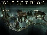
Alpestrine

Half-Life: Deathmatch HLDM
Alpestrine by Rimrook
Posted 17 years ago2007-04-29 21:16:42 UTC • Completed • Half-Life: Deathmatch
Loading...
Screenshot Thumbnail
Name
Alpestrine
By
Rimrook Rimrook
Type
Map
Engine
Goldsource
Game
Half-Life: Deathmatch
Category
Completed
Included
BSP
Created
17 years ago2007-04-29 21:16:42 UTC
Updated
17 years ago2007-05-09 19:14:56 UTC
Views
10523
Downloads
1661
Comments
23
Rating
4.88 (8)
Reviews
0
full star full star full star full star full star Download (1.31mb)

Its finally done!

Another high altitude castle map with a different style compared to some of my other maps.

so enjoy it already :D

23 Comments

Commented 17 years ago2007-04-29 21:38:57 UTC Comment #14762
Your BSP is corrupt or something. It doesn't show up as a BSP file when I look at it in Explorer, it won't show in my maps list, and I can't launch it manually. I downloaded it again just to make sure, but I think it's somehow screwed up... :
Commented 17 years ago2007-04-29 21:43:24 UTC Comment #14763
The bsp file didn't have the .BSP extension. I fixed it, so try it now.
Commented 17 years ago2007-04-29 21:47:36 UTC Comment #14764
Is that all? Haha...
Commented 17 years ago2007-04-29 22:10:05 UTC Comment #14765
Very very nice, but a bit cramped. It couldn't really be played with more than 4 people at once. It wasn't too different from your usual style, but that's alright with me. :)

The only thing I could think of that you could fix would be the ambient sounds. They're only coming from one point on the map, and it's horribly obvious with my 5.1 surround speakers.

I'm not going to bother pointing out what you did right here, since you did everything else as well as you normally do. I think my compliments would just seem redundant.
Commented 17 years ago2007-05-01 16:51:13 UTC Comment #14774
Nice map. But the Trees splits white blood.
Commented 17 years ago2007-05-01 17:51:33 UTC Comment #14775
Hey, they're not my models. They're from DoD. I dunno why they do that.
Commented 17 years ago2007-05-01 18:34:33 UTC Comment #14776
Think of that as a unique charm...o_o
Commented 17 years ago2007-05-01 22:31:41 UTC Comment #14778
It has to do with the entity you used to place the model, not the model itself. It's certainly fixable.
Commented 17 years ago2007-05-02 16:44:47 UTC Comment #14779
damn, i think that was said with poison garden. I made the same mistake this time again. :(
Commented 17 years ago2007-05-02 17:39:33 UTC Comment #14780
for a dm map there wasnt realy that much room to play. The map was definetly different and gave me a neat feeling thow this didnt realy take effect until i looked up. in my op def. not a 5 star but it was realy different. Kinda inspires me to make my lazy a self map some more...keep up w the hl1 maps bc thats all i gotz :) oh and the tree models showed red textured squares around the branches...4 somereason they werent masked...
Commented 17 years ago2007-05-03 07:56:26 UTC Comment #14783
it amazes me that he cant manage several 3 letter words.
Commented 17 years ago2007-05-04 03:22:52 UTC Comment #14792
I liked the building stretching into the sky the best but overall it was fantastic. The only bad thing was the wind sound, you made it too loud and gave me a headache after listening to it for several minutes. Nice dm level!
Commented 17 years ago2007-05-04 07:38:32 UTC Comment #14794
look mate, I fucking love your textures.
Commented 17 years ago2007-05-04 16:28:54 UTC Comment #14797
i smell a nerd
Commented 17 years ago2007-05-04 18:31:37 UTC Comment #14798
Somereason IS A WORD. As are bc, op, and w.
Commented 17 years ago2007-05-06 13:05:19 UTC Comment #14806
Another nice and clean map. Good use of sprites, beautiful colors, and brutally precise textures. The only thing, that was a bit weird for me, was the skybox with two suns. Or was it on purpose?

Anyway, good work. Five stars.
Commented 17 years ago2007-05-06 15:44:22 UTC Comment #14807
Yes, that's one of the default Xen skyboxes. I congratulate you for not making me add six more TGAs to my gfx/env folder. :D
Commented 17 years ago2007-05-07 04:36:57 UTC Comment #14810
Oh, sorry for the noobness. :P
Commented 17 years ago2007-05-08 11:50:21 UTC Comment #14821
It's just awesome :)
Commented 17 years ago2007-05-17 13:45:23 UTC Comment #14918
The word awesome is indeed an appropriate one to describe this map.

Veeery nice.
Commented 16 years ago2008-02-18 21:43:23 UTC Comment #16423
I saw somebody voted for this for map of the year, so I tried it.

Whoa!

It reminds me of the jedi temple outside portions from battlefront/battlefront II. Very sleek, pretty, and the layout is well thought out. You're impressed by all this, and then you look up and go "Whoa" seeing the backdrop, which was an excellent touch.

Map is excellent, but I'll try anyway to make possible suggestions for an Alpestrine 2:

1. I was listening to sigur ros on headphones, so I can't recall if there were sounds, but they couldn't have been too loud if they were. Maybe add more?

2.Add some nice statuary or fountains. I realize r_speeds are a concern.

3. Make it a tad bigger possibley.

4. Add more vertical gameplay possibly. You could make some of the up-high windows accessible, but would probably lead to nasty campers/snipers.

5. Perhaps add interior rooms>

Don't get me wrong now, even though I mentioned all that stuff, this map is still one of the best I've seen here. It's distinctly original, pretty, and well thought out, elegant.

5 stars, and I'm adding it to my vote for map of the year.
Great work! = )
Commented 12 years ago2012-05-25 20:48:39 UTC Comment #19486
Nice mapping, terrible gameplay...
Commented 3 years ago2020-12-16 15:22:16 UTC Comment #103139
I disagree that it's too small, I like fighting close. This map is a lot of fun

You must log in to post a comment. You can login or register a new account.