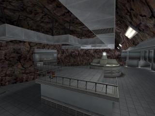
dm_undergroundlab
 HLDM
HLDM
dm_undergroundlab
by
The Mad Carrot
Posted 15 years ago2009-07-20 09:27:14 UTC •
Completed •
Half-Life: Deathmatch
- Name
- dm_undergroundlab
- By
-
 The Mad Carrot
 - Type
- Map
- Engine
- Goldsource
- Game
- Half-Life: Deathmatch
- Category
- Completed
- Included
- BSP
- Created
- 15 years ago2009-07-20 09:27:14 UTC
- Updated
- 15 years ago2009-07-20 15:10:15 UTC
- Views
- 8125
- Downloads
- 1498
- Comments
- 12
- Rating
- 5.00 (4)
- Reviews
- 0
This is my entry for the second "Map from Layout" compo.
It's not perfect, as i screwed up bigtime near the end of the compo, forcing me to make an alternative path not shown on the layout image.
But i think i got the overall layout pretty much right.
Also, i just played through it again, and i think i've put in too little weapons. Ill fix that.
This map features the best vertex manipulation work i've ever done before.
A potential candidate for World Crafter's HLDM server?
UPDATED!
- Fixed ladder
- Fixed monitor
12 Comments
You must log in to post a comment. You can login or register a new account.


Theres some epic use of submerged.wad though. Huge ammounts of geometry detail.
There were just a few flaws. There was the ladder, as above, and there is also the credits screen. It was backwards, and you could see the void. Just put some black back there, and align it to face.
Beautiful map. Now if only I could play it with opponents...
I would change to a 5 star if I could.
Changed it for you -O
I love the layout and texturing throughout. It's not too big or small, too complex or too simple. while most all the areas look great, some areas seem to be pretty wide open, though there is still cover points all around. I love the way the lighting looks through most areas(did you use different colors under some of the archways?), it's varied and light coming from the little floor trim lights and computer consoles looks neat.
I didn't notice any sounds except in the cave room, some more would probably be nice, maybe some computer sounds announcements, or anything really.
WE SHOULD TOTALLY GET THIS MAP ON A SERVER!
The cave room is extraordinary but a couple nitpicking notes:
1. It's super hard to appreciate exotic brushwork in goldsource. you could have made the cave structure 2/3 less complex, and it would look almost identical with the same texturing. the only way around this is to maybe use a different texture or smaller texture scale, or even tweak the alignment, to make your individually hewn out faces you worked so hard on, to show up better. You can also try using the lighting down but then you get some harsh shadows and completely dark faces sometimes.
2. I only saw one visual glitch in the cave room above the little room at the top of the stairs.
3. the ductwork looks unnaturally bright like it's glowing. I know it was probably a challenge to light this room properly, so you might have it as good as it can get. Possibly darkening the whole cave area might solve this and other problems, but probably not.
Thanks, Captain!
1. The credits screen have text written in the wrong order.
2. There an invalid face(?) in the rock wall.
3. The stairs nearest to the rock wall glitch have a problem at the top. You "sink" into the ground if you walk down the stairs in a wrong angle.
4. I don't know if this is a mistake but the pyramid type thingie near the stairs mentioned above has a round sprite which seems to appear only when standing in specific places. I think this is because the sprite is set too low; the edge of the tip of the pyramid is blocking its visibility.