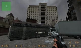
de_soup
 CSS
CSS
de_soup
by
Dimbeak
Posted 12 years ago2012-06-21 17:39:14 UTC •
Completed •
Counter-Strike: Source
My very first CSS map.
A very small map that was a side-project, takes place at a drive-thru-only small restaraunt and its parking lot.
A very small map that was a side-project, takes place at a drive-thru-only small restaraunt and its parking lot.
8 Comments
You must log in to post a comment. You can login or register a new account.


I'll just run off some mistakes I noticed. Nothing too major.
1. Prop choice - Always try to create a consistent visual theme and ensure that props aren't just random. Think about the purpose they serve. For example, why on earth is there a metal shelf with paper towels and cardboard on it in what looks like a parking bay outside? Screenshot
2. Test thoroughly - Within about 20 secs of loading up the map I noticed that this fence wasn't solid. Easily fixable. Lazy! Screenshot
3. Unbreakable props - One of the best elements of cs_office are the awesome breakable computers. Why you chose the LOD static version for this, I have no idea. You can shoot it and it won't break. Screenshot
4. Prop Collision - If you're determined to have physics props in your map, make absolutely sure they won't obstruct the player! It's infuriating to get stuck on something daft in the middle of a firefight. Small props like these MUST be flagged "debris" so that they can still be shot, but won't interfere with player movement. Screenshot
5. Invisible Walls - My worst enemy. There is never, ever, ever a good excuse for these existing. Screenshot
6. No/Fast VIS - While in a map this small it's not too important, your release version should have always undergone a full compile. Why? Because the entire map is rendered from everywhere in the map. All the models, all the brushwork - it's all being rendered even when players are looking out to the skybox. On a larger map, this would absolutely kill performance. Screenshot
Overall it's a good start. Plenty of mistakes, but you learn from those and make better maps in the future. It's too small to be able to play a proper game on, and it's annoying that a nav mesh wasn't included to play with bots. A radar image'd be nice, too.
Keep at it.
I was going to say the same thing: not a bad start!
I will add that I didn't like the lighting, it seemed a bit too bland.
The pathways feel a bit too tight, and the bomb location will never be, in practice, reached by the terrorists. A truck of that size being parked in that place looks odd, don't you think?
You're doing well. I encourage you to step further with a bigger map.
I love the detailing inside and out, and the 3dsky is bitchin. the only distractons for me was the lighting is a bit bright on the interiors, and the map is a bit smallish, other than that i like it!
good work sir, keep it up!
Plus i feel a 5-star rating system is a bit lacking since 1-3 stars is horrible to rank average, so i personally feel rating a map I like < 4 stars an insult, and 5 stars to some people is the unattainable "perfect" map, which doesn't even exist.
But ya, maybe 3 stars is more like it for this map then.