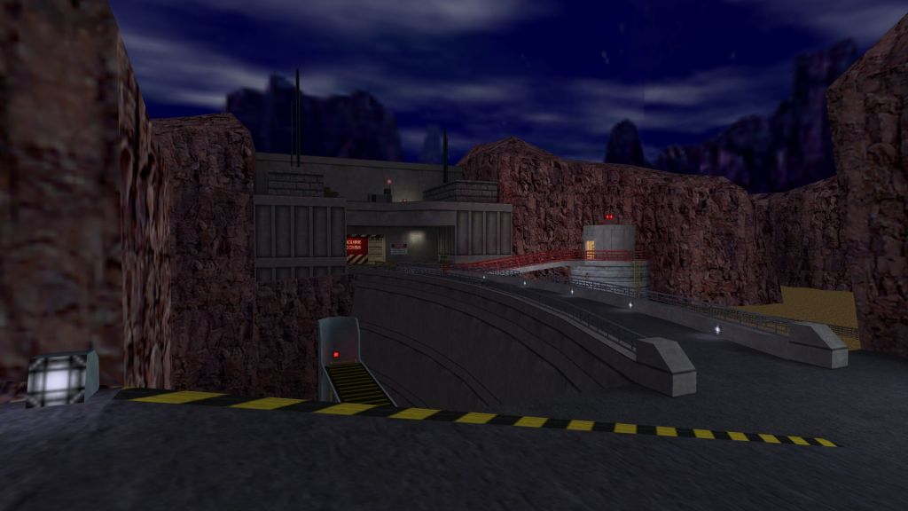
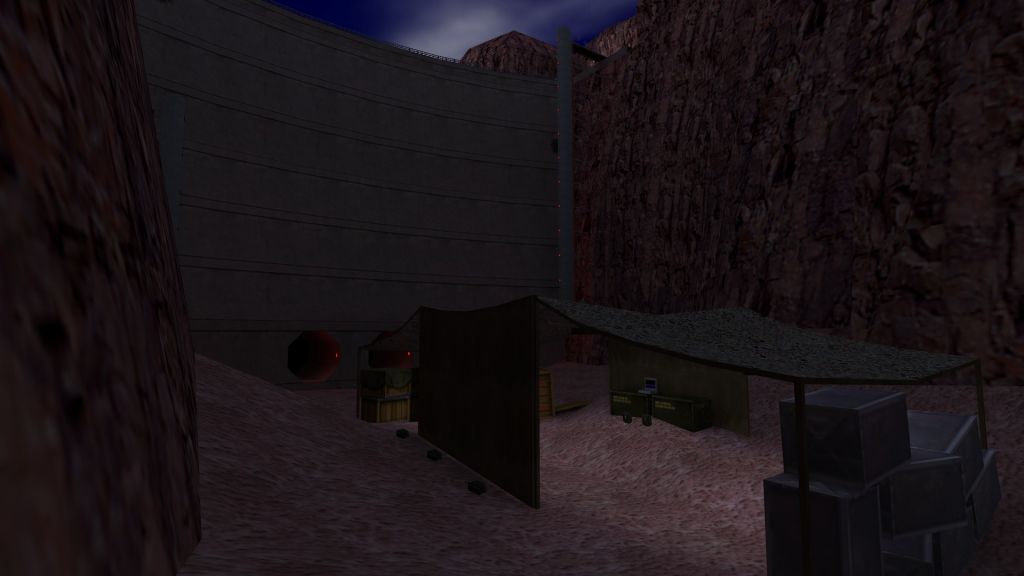
dm_hydroelectric
 HLDM
HLDM
dm_hydroelectric
by
Jessie
Posted 7 years ago2017-03-02 00:00:23 UTC •
Completed •
Half-Life: Deathmatch
- Name
- dm_hydroelectric
- By
-
 Jessie
 - Type
- Map
- Engine
- Goldsource
- Game
- Half-Life: Deathmatch
- Category
- Completed
- Included
- BSP, RMF/VMF
- Created
- 7 years ago2017-03-02 00:00:23 UTC
- Updated
- 6 years ago2018-06-02 14:14:44 UTC
- Views
- 7267
- Downloads
- 1296
- Comments
- 17
- Rating
- 4.17 (6)
- Reviews
- 0
My entry for Competition 34 - Half-Life Re-imagined. Shouldn't be hard to guess which map it's a remake of!
I'm calling it done, unless something particularly untenable is brought to my attention.
Hope you enjoy!
*** Updated to version 1.0.3.
*** Now includes the .VMF file!
I'm calling it done, unless something particularly untenable is brought to my attention.
Hope you enjoy!
*** Updated to version 1.0.3.
*** Now includes the .VMF file!
17 Comments
You must log in to post a comment. You can login or register a new account.


Revision one will include:
Revision two will include:
Revision two uploaded. Readme now states version number (1.0.2), so check it if you're not sure you've the latest version.
I really like the idea about this map.
+ Huge map with much stuff to explore
+ Cool use of the Apache
+ I love the underwater part with the flooded building and the glass pipes
+ Ambience is sweet, feels like a real hl1 map directly out of the sp.
- Weapon/Item Placement is awfull for DM. ( as example: corners with 5 Batterys.... never do that, 2 Batterys in a corner is good to go )
- because of the water and the high wpolys the map felt a bit laggy, maybe the engine has troubles with such big scaled water brushes, try using a normal brush with water texture, it will block vis too, or use water without waves to test if fps/ms getting better.
4/5 Stars for you
contra:
I agree with Trempler's weapon/item placement issues. More numerous basic weapons + more spread out batteries would be a great starting point.
Otherwise, the only flaw I noticed was that the max viewable distance is short by around 256 units.
Also the turbine button should do something :>
I especially liked the radio, it adds a bit of franticness and an opportunity for players to stop fighting each other and focus on working together.
Porting a single player map to HLDM is OK, but this threathens originality. What did the map creator tried to do? Was this an attempt at making something different? If not, good conversion job, otherwise, I unfortunately was far from impressed by the midly interesting additions. This looks to me like a rather by the book replicate of the original without effective efforts at brining something to the concept.
Overall, I'd say the map is more space to add to the ocean of dull uninteractive space most HLDM maps constitute. (Which is a true boring cancer.) There are many occasions where you'd expect control panels or laptops to do something, but they're disappointingly just for show. Why? C'mon! The walkie-talkie at the top of the end of the dam actually brings out an helicopter, but that's an element we know from the original map. IMO, the creator didn't put one second into trying to do something new. I wouldn't be able to call that an actual coop feature.
Some doors do nothing, but suggest otherwise (e.g.: under the dam tower). Perhaps a trailer video or walkthrough description wouldn't be bad after all. Isn't it?
Otherwise, underwater windowed pipes are cool while the dam tunnels directly cut from water to air and feel broken.
Design: 3/5
Gameplay: 1/5
Lighting: 3.5/5
Creativity: 0/5
Since when game reviewing requires being able to make games anyways?
It's sick how you guys protect yourselves and your incredibly conservative/unimaginative concepts.
It's like hurray 5/5, you've made another gray poop. You're so focused on masterbating on you maps' visual features that you miss how deadly boring and static they are.
Dude, stop being overly critical and maybe appreciate what I'm sure was quite a lot of work for Jessie.