Competition: Map From Layout
Closed
View Results
- Open Date
- 17 years ago2007-09-29 00:00:00 UTC
- Close Date
- 17 years ago2007-11-06 23:59:59 UTC
- Type
- Map from Base
- Allowed Engines
- Goldsource
- Judging Type
- Judged (all engines combined)
- Judges
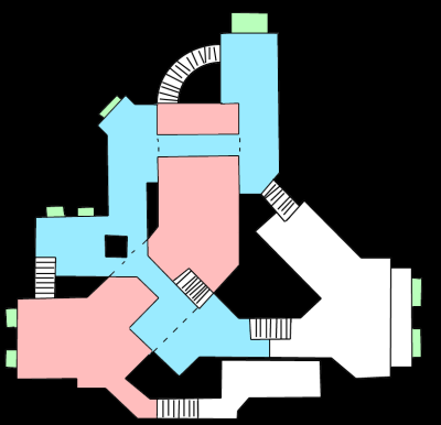
Create a singleplayer or multiplayer map from the following 2D layout. If singleplayer, the map must have a definite start and finish. Otherwise, the only rule is that it adhere to the layout as much as possible.
Allowed games are:
This competition is for Half-Life 1 and Source, but they will be judged together, and there will be only 1 first place. Custom content is allowed.
Credit to Rimrook for the layout.
Allowed games are:
- Singleplayer:
- Half-Life 1 (STEAM COMPATIBLE)
- Half-Life 2 (Via Source SDK Base)
- Multiplayer:
- Half-Life: Deathmatch
- Half-Life 2: Deathmatch
- Counter-Strike
- Counter-Strike: Source
About the layout
- The layout is multi-levelled, with the blue level above the pink one. The white levels may be above or below their adjoining levels.
- The stairs are just a guide. These may be replaced by a ramp or some other means of traversing the height difference.
- The alcoves in green are optional additions, and are examples of where the layout can be varied slightly without breaking the rules.
- Note that this layout is for walkable area only, extra stuff can be added for cosmetic purposes, as long as it is not traversable. Also note that the layout has no scale, and is not limited to indoors. Elements such as stairs, rooms and hallways can be stretched to your liking, as long as it represents the basic structure of the layout.
This competition is for Half-Life 1 and Source, but they will be judged together, and there will be only 1 first place. Custom content is allowed.
Credit to Rimrook for the layout.
Results
Judged By:
 Penguinboy
•
 Strider
As a bonus for everyone who entered, we are giving reviews for all entries. On top of that, you each get two reviews each! We had a respectable number of entries this time round, although not as many as we first expected.
And now, for the winners!
And now, for the winners!
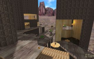
Coming in first is DocRock's solid mapping effort, dr_jungle (HLDM).
Download it here
Strider
This map offers a great combination of quirky style, and fun, open gameplay to give the players something rather unique. It may not be perfect (I'm pretty sure you need to be Superman to get the Egon) but overall the map is an absolute blast online.
Penguinboy
This map is a lot of fun when played with 4 or so people. The style of the map is unique, and weapon placement is well done throughout. There are maybe a few too many longjump modules, and when you fall off the edge you should die instead of being teleported back, but other than that, a well deserving first place.
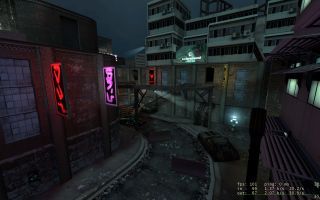
Second Place: Trapt, with dm_vapour for HL2DM
Download it here
Strider
Trapt has already established himself as a pretty talented mapper, so it comes as no surprise that this is a well made map. My only problem with this map is the highly unoriginal theme, but this isn't too bad when it looks a nice as it does. Overall, it's well crafted and fun to play (and oh boy, what a secret).
Penguinboy
Trapt's map is well constructed and makes good use of the layout without making it too obvious. The map works well with its 3D skybox, and the prop placement is solid. The map relies completely from content from the mod 'Dystopia', and some could see this as bad. Focus on the open area means some parts of the map are abandoned during gameplay.
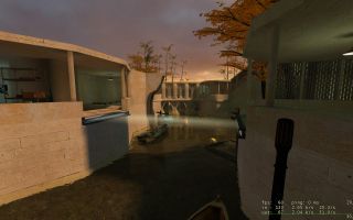
Third place goes to Doodle's dm_biological for HL2DM.
Download it here
Strider
Doodle is continuing to show his knack for great themes in his latest entry. The feel of this map is quite unique, and it's very true to the layout. There are a few things that bring it down though, like way too many physics objects in confined spaces, but overall he's established the theme well and came up with a pleasing entry.
Penguinboy
Doodle's map looks great, and the lighting is spot-on. The light bridge is creative and looks great, and he has manipulated the layout fairly well. It does suffer from overcrowding (too many physics objects) in most places, and some parts look rushed (and the crossbow doesn't work). Overall, a great map, but a few pitfalls stopped it from getting first place.
Blitzkrieg (HL2DM)
StriderWhile i'm not a major fan of Half-Life 2's canal areas, Blitzkreig portrayed them quite well in his entry. The mapping quality is consistent, and the layout is very accurate, but unfortunately one large central area is dark enough for players to hide in and score highly. Ignoring that, it's a fun map and I can see a number of fun Gravity Gun battles being had.
Penguinboy
Blitzkreig, by far, made the best use of the layout out of all the entries. Well placed windows and added ledges within the rooms add an unexpected layer to the gameplay. Unfortunately, it's blocky in places, and the lighting isn't as good as it could be. Also none of the medkits work, and there is some badly placed clipping in some places. If there was a fourth place, this would be it.
dm_particle, by Masta Killa (HLDM)
StriderMasta Killa chose a great theme for his map, and generally pulled it off quite well. Yes, there are a few areas that are way too dark for HLDM gameplay, and a few areas that don't look as good as they probably could, but overall it's a pretty solid entry and definately not one to pass up.
Penguinboy
Masta Killa's dm_particle is well made in some areas, especially the room with the stairs. But, it also has a few bugs, such as strange flashing sprites in the outside area. The map is very dark in most places, and although some dark places are ok, some extra light would have been very welcome.
Deathan (CS)
StriderVisually, Deathans map had one of the most impressive rooms i've ever seen in a GldSrc map, unfortunately the quality wasn't consistent through the rest of it. Gameplay-wise, it was pretty fun, and well thought out, making it a solid entry regardless. Definately one of the nicer custom CS maps out there.
Penguinboy
Deathan's map is one of two entries for Counter-Strike, and has an impressive centerpiece. This room has terrific lighting and brushwork, but unfortunately this does not carry across to the rest of the map, which is a bit blocky. Still, as a first time entry, this map is quite well made.
Ghetto (CS:S)
StriderGhetto has being showing nothing but improvement since he joined TWHL, and it's no different with his entry. While it still needs some work, particularly with the brushes, it's a good example of how quickly he's learning and what we can expect next. The theme may not be portrayed as best it could, but it's a great start for a first-time entrant.
Penguinboy
Ghetto has produced a fairly decent map considering his skill level and the time he's been mapping. It follows the layout fairly well (except for an extra room), and in some places modifies it creatively. The map is very blocky, although with some additions of more props, liberal use of displacements and a 3D skybox, this entry would be quite good. A worthy first-time entry.
McMitcho (CS)
StriderI had no idea what mcmitcho was capable of until I saw this entry, and i've gotta say i'm impressed. He pulled of his theme very well, but unfortunately I feel he didn't make very good use of the layout, especially when choosing to make it for CS. Still, we had fun playing this map, just not how CS usually intends us to.
Penguinboy
This entry was one of the more original maps, taking place in some sort of space-station/asteroid thing. While the interiors aren't bad, the texturing seems a bit odd. Clever use of the light coming from the fan is impressive, but some areas looked a bit flat. The layout isn't really used to the full potential, but all besides - a great map with an interesting theme.
Tetsu0 (HL)
StriderAs the only singleplayer map submitted, I had hoped Tetsu0's was a blast to play... and it was, mostly. Tetsu0 worked the layout very well, making it last a fairly long time for only one map, and visually it was quite pleasing. My biggest problem with this map is the rather clueless ending and aggravating beginning, but looking back at it I found I still had a fun time shooting my way through this.
Penguinboy
This entry was fairly good as a standalone entry, and had a fair amount of gameplay in it for such a small map. The start of the map had a fair few bugs, and being a fast reader I had to wait for quite a while before being able to play after the 'letter reading' opening bit. A few confusing bits and one of the weirdest endings ever left me scratching my head after playing this map.


