Competition 24: Map from Layout Created 17 years ago2007-09-30 05:57:14 UTC by AJ AJ

Created 17 years ago2007-09-30 05:57:14 UTC by AJ AJ

Posted 17 years ago2007-09-30 05:57:14 UTC Post #235295
Yes, as many of you might have guessed from the news post earlier this week, TWHL's famous competitions have returned! While we did say that we'd wait till TWHL3 before announcing another competition, we decided that we'd go ahead with this one anyway.

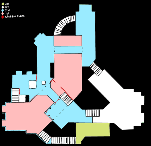
Given that the last competition generated some whinging from certain untalented jackasses, this competition has been designed to be dead simple. Do what you want, so long as it adheres to the layout (thanks to Rimrook).

But alas! What is the surprise? Well, for the first time ever in TWHL history, we actually have prizes for all those who place in this compo (that is, 1st, 2nd and 3rd)! Yes, real, tangible, PHYSICAL prizes! Each winner will receive the same prize (considering this is our first time), so get cracking.

The prizes are:
  • An exclusive, limited edition "YOU'RE WINNER" glossy sticker
  • A personalised congratulatory letter, 'signed' by the current TWHL mods
  • A REAL envelope with a REAL Australian postage stamp or two
(Keep in mind you'll need to give one of us your postal address if you win so we can send it out)

So, have fun and get cracking: you have a little over a month to produce something worthy of a YOU'RE WINNER sticker!

This competition brought to you by the TWHL mods that still exist around here: Penguinboy, Strideh and myself.
AJ AJGlorious Overlord
Posted 17 years ago2007-09-30 06:14:26 UTC Post #235296
Note that you'll need to supply a mailing address to recieve the stickers, be it home, work or a PO box. If you don't want to, we'll email you the letter in PDF format for you to print out and a copy of the "YOU'RE WINNER" picture instead. But that will be handled after judging, so don't worry about that for now.
Penguinboy PenguinboyHaha, I died again!
Posted 17 years ago2007-09-30 09:44:21 UTC Post #235306
map from layout? Does that mean we just make the layout of a map using the dev/dev textures pretty much?
Posted 17 years ago2007-09-30 09:49:30 UTC Post #235307
No, it means you make a full map using that layout. Sheesh, wouldn't be much of a competition if all you did was recreate the layout!
AJ AJGlorious Overlord
Posted 17 years ago2007-09-30 11:43:00 UTC Post #235313
Wait, so the green areas, we are allowed to expand with them but they aren't allowed to be walkable? Then what the heck is the point?
Posted 17 years ago2007-09-30 11:49:28 UTC Post #235316
Perhaps for a distanct view? Something to add realism and make the World seem bigger? Like a sea with a boat...Half can be done with 3D Skybox and the rest is connected to it...

But as for Half Life...What is the point :D
Habboi HabboiSticky White Love Glue
Posted 17 years ago2007-09-30 11:58:51 UTC Post #235322
That's where your imagination comes in.
AJ AJGlorious Overlord
Posted 17 years ago2007-09-30 12:01:35 UTC Post #235323
Pretty much. There's quite a bit of freedom to play around with this layout, as such there shouldn't be many problems with finding a suitable theme.
The alcoves in green are optional additions, and are examples of where the layout can be varied slightly without breaking the rules.
They can be walkable space, but they shouldn't really be anything more than minor additions to the layout, such as closed doorways or archways (so no stretching corridors, vents, etc.). Or, if you wish, they could be lookout points for vistas. It's up to you.
Strider StriderTuned to a dead channel.
Posted 17 years ago2007-09-30 17:14:14 UTC Post #235339
The traced version of the layout looks kinda shotty. Is there a any good reason why a grid isn't projected onto it? for mappers to make up their own proportions maybe?

because I still have the original here.
Rimrook RimrookSince 2003
Posted 17 years ago2007-09-30 23:36:36 UTC Post #235354
I decided to type this up so people could correctly interpret the rules here..
Does that mean we just make the layout of a map using the dev/dev textures pretty much?
-'Map from layout' says that this should be your layout.. It needs to be a fully textured/litten map, as long as it adheres to the the layout. This also means you can scale it as large as you need to, it just needs to look vaguely like the 'shape' of the drawing.
Wait, so the green areas, we are allowed to expand with them but they aren't allowed to be walkable? Then what the heck is the point?
Add a pretty view.. a small patio.. a joke.. something that will visually make your map look better or interesting. This basically asks you to make minor adjustments to the map, just nothing drastic. This sticks to veery small space additions, little nooks, or a closet. If this does become drastic, it's in 'looks'.. You must restrict the player from being able to walk it. This was done to clear up peoples disliking of sticking -strictly to this layout, while also giving us the chance to see creativity as to how people look at this layout.

-Although the layout is nice and blocked up for our viewing pleasure, your entry doesn't have to adhere strictly to it.. Add supports or smaller obsticals in the way of things. They've loosened the leash for this layout.

-Just because the layout shows a stairway doesn't means they have to be readily used at all times. You can make them designed for later use. For instance.. add something that stops you from using it until later in your entry. This is essential because the rules mention a 'story'.

-Be sure to get interesting with the stairs too.. Dont go about only using the conventional means to get around to places. Depending on the situation, they can be problematic to fit into an area. For source people. you can use the physics here.. The rules only say it has to be traversable. This means you can even stack boxes if you want to.

When the rules mention a story, this doesn't mean you have to have to write a fully winded out story based on this layout. This boils down to "Have a goal, and a reason as to why you're doing it." - You only need a plot
TheGrimReafer TheGrimReaferADMININATOR
Posted 17 years ago2007-09-30 23:38:26 UTC Post #235355
This is a realy kewl compo. Good thing i checked out twhl it was runin dry for a while.
Posted 17 years ago2007-10-01 04:07:58 UTC Post #235359
Lets get some things straight.

[m]THE COMPO IS NOW OPEN TO SINGLEPLAYER AND MULTIPLAYER. THE COMPO PAGE HAS BEEN UPDATED. READ IT TO SEE THE ALLOWED GAMES.[/m]

All Grim's points are correct, except the last one about a story, which is now only valid when doing a singleplayer map.

Rimrook, if you want to do your own traced version, be my guest. Theres no grid because yes, mappers can make up their own proportions.

below is a very simple, made in paint, modification of the layout, that is perfectly valid, but won't score you points in creativity. The closer the better, but changes such as this will be accepted.
User posted image
Penguinboy PenguinboyHaha, I died again!
Posted 17 years ago2007-10-02 00:04:37 UTC Post #235428
DOODELDOO spitroast fan bumpety.
Posted 17 years ago2007-10-02 01:13:13 UTC Post #235430
[BUMP]Venetia is pretty awesome, eh?[/BUMP]
AJ AJGlorious Overlord
Posted 17 years ago2007-10-02 02:38:39 UTC Post #235434
Get on topic or i'll ban you!!!

I'm curious, how many people are looking to join this competition? I'm just looking for some initial figures here seeing as i'll be one of the people judging.
Strider StriderTuned to a dead channel.
Posted 17 years ago2007-10-02 02:45:13 UTC Post #235436
I'm in. Venetia > Strideh
Posted 17 years ago2007-10-02 02:50:38 UTC Post #235437
Looks like I checked back in time! I hope I get a internet connection in time before the end of the compo 'cause I'm in for sure!!!
Posted 17 years ago2007-10-02 13:52:32 UTC Post #235473
Im prolly entering but im just wondering. Did the winner of the water compo "hotdog or doodle" decide on this theme? Because I probably wont want to enter if I know winning wont allow me to make the next compo theme. By the way, rimrock already had a map with the same floor plan as the compo's, hmm strange. Lol jk...
Posted 17 years ago2007-10-02 14:27:02 UTC Post #235476
I'm going to join this one :)
Posted 17 years ago2007-10-02 14:28:45 UTC Post #235477
I have just started mine :)
Moaby MoabyMk. III
Posted 17 years ago2007-10-02 15:29:14 UTC Post #235483
@zeeba: dewdle assisted in making this compo.
Penguinboy PenguinboyHaha, I died again!
Posted 17 years ago2007-10-02 22:37:27 UTC Post #235507
Pretty dumb reason not to enter if you ask me, zeeba.
AJ AJGlorious Overlord
Posted 17 years ago2007-10-03 01:03:25 UTC Post #235510
Well it seems there's plenty of interest in this compo, that's good news.
Strider StriderTuned to a dead channel.
Posted 17 years ago2007-10-03 08:08:13 UTC Post #235524
i just got the layout mapped. then when i have time, i'm going to detail it, and throw in entity work :)
Tetsu0 Tetsu0Positive Chaos
Posted 17 years ago2007-10-03 11:50:21 UTC Post #235543
So if i go for the original layout, And make a Css map, does it has to be exactly the same as the Lay-out picture, or can it be a bit modified? For example something like this:
User posted image
Skals SkalsLevel Designer
Posted 17 years ago2007-10-03 15:21:20 UTC Post #235553
Its not a dumb reason not to enter. I have many really good ideas for a competition. The only thing dumb is to not allow the winner to decide. I entered the water competition thinking I would have a chance at choosing the next one but apparently even if I had won first place, I wouldn't have had a say...

-Anyways, say if I did enter this competition... If I won first place would yall atleast consider some of my ideas?
Posted 17 years ago2007-10-03 15:34:46 UTC Post #235554
That's actually not a bad map layout for a chav :)
Posted 17 years ago2007-10-03 17:37:52 UTC Post #235569
didnt you listen zeeba? doodle won the last compo and he helped with this compo.

ghetto: that's not allowed, because you've added an extra pathway (at the T spawn). you can modify the structure, as long as the available paths remain the same.
Penguinboy PenguinboyHaha, I died again!
Posted 17 years ago2007-10-03 18:39:24 UTC Post #235586
That's actually not a bad map layout for a chav
I lol'd
monster_urby monster_urbyGoldsourcerer
Posted 17 years ago2007-10-03 19:07:32 UTC Post #235593
dude you can't even make a modification that small... I was going to do the exact same thing because I didn't want such a dead end on a multi player map. n btw hlhotdog won too. n the only reason doodle won was because noone else entered for source besides that efortless pond.
Posted 17 years ago2007-10-03 19:17:29 UTC Post #235595
I'm officially in. i've had some free time and i got the layout down, and i'm detailing now!
Tetsu0 Tetsu0Positive Chaos
Posted 17 years ago2007-10-03 19:54:21 UTC Post #235600
the only reason doodle won was because noone else entered for source besides that efortless pond.
And? What's done is done, the compo is decided. Make a first place entry.. and if you care enough to follow up on deciding the next compo, then do that.
TheGrimReafer TheGrimReaferADMININATOR
Posted 17 years ago2007-10-03 19:59:36 UTC Post #235602
hey, the only reason doodle got second is because he bribed ant! otherwise i would have won! my map was the greatest.
Penguinboy PenguinboyHaha, I died again!
Posted 17 years ago2007-10-03 20:57:28 UTC Post #235607
Hahhaha, Penguin you are as modest as ever ;)
Posted 17 years ago2007-10-03 21:19:46 UTC Post #235609
Penguinboy: Your sexual favours paled in comparison to doodle's.
AJ AJGlorious Overlord
Posted 17 years ago2007-10-03 21:21:31 UTC Post #235610
wait, is the modification ghetto made not allowed? Let's say it were a window, but big enough to crawl through, would that be ok? That is a really small modification if you ask me.
Posted 17 years ago2007-10-04 02:35:01 UTC Post #235625
If there would be just one type of exit from the terrorists base that wouldn't be interesting. Well i could change the terrorists base to another spot... but if its really necessary, Then maybe something like this:
User posted image
P.S: i've finished the hospital roof and a bit of the blue spot already.
Skals SkalsLevel Designer
Posted 17 years ago2007-10-04 05:58:43 UTC Post #235629
that new layout is fine.

@blitz: it could be a window, but it cant be traversable, meaning you cannot go through it. you can modify the scale/size/structure or each room, as long as the paths between them are still existant, without any extra paths.
Penguinboy PenguinboyHaha, I died again!
Posted 17 years ago2007-10-04 06:46:53 UTC Post #235633
I've done the lower part of the map. It will be something like sewers.
Posted 17 years ago2007-10-04 07:11:31 UTC Post #235635
Mine will be some sort of a space station, I've never done a sci-fi style map...this will look so horrible :P
Posted 17 years ago2007-10-04 08:05:11 UTC Post #235636
I'm doing a jungle/water/rock theme
Tetsu0 Tetsu0Positive Chaos
Posted 17 years ago2007-10-04 11:43:32 UTC Post #235647
Im doing a city like place something like an estate tho.
Skals SkalsLevel Designer
Posted 17 years ago2007-10-04 14:41:34 UTC Post #235653
I just need to find some good textures to fit my idea ><. Maybe the Aztec wad, although thats too green.
Posted 17 years ago2007-10-04 15:13:21 UTC Post #235657
so is anyone gonna post screenies? or keep it under wraps until its time to enter?
just wondering, because i only have one area slightly detailed as for now.
Tetsu0 Tetsu0Positive Chaos
Posted 17 years ago2007-10-04 15:44:56 UTC Post #235661
mmm, looks like there should be lots of good entries coming! :)

do it for the sticker!
Penguinboy PenguinboyHaha, I died again!
Posted 17 years ago2007-10-04 15:54:34 UTC Post #235665
I think I'm also in. I just hope, that it won't get too complex for the goldsource engine :glad:

Gonna post some screenies soon...
Taylor TaylorJohn Romero's Bitch
Posted 17 years ago2007-10-04 21:24:47 UTC Post #235683
As always, I'm going single player. Not that I don't like multiplayer but I play more SP. I took one look at the layout and quite an obvious structure lept out at me. I'm keeping mine under wraps. Nothing better than a little surprise! Also, may I say that (to clear the air) I chose not to decide the next comp because I couldn't think up any good ideas that could work in a compo so I just offered some ideas and left them to it. Frankly, I like a challenge and when you know what you want to do it's not a challenge at all. Unfortunately, I may be pushing Gold Source engine too far (again!!!) but I hope I have room to draw the outside areas. I've learnt some new hammer tricks and got some good tools to build great outdoor areas so you all have to wait and see!!!
Posted 17 years ago2007-10-04 21:38:37 UTC Post #235688
gret. hlhotdog has new chetz.
Posted 17 years ago2007-10-04 22:00:37 UTC Post #235690
What did you say, sorry, I'm not sure I understand?

EDIT#

Oh I see, tools aren't cheats. Anyway, they are not programs that make maps for you, just some good texture editing programs. I hate cheaters anyway, so I'm not going to be one!!
Posted 17 years ago2007-10-05 04:39:56 UTC Post #235696
This is a cool comp! Here's what I've got going with the map, wondering if my changes to the layout keep it admissible or not;
User posted image
User posted image
You must be logged in to post a response.