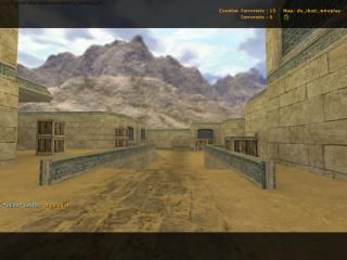
de_dust_wireplay
 CS
CS
de_dust_wireplay
by
Lekta
Posted 20 years ago2004-06-23 06:31:44 UTC •
Completed •
Counter-Strike
- Name
- de_dust_wireplay
- By
-
 Lekta
Lekta - Type
- Map
- Engine
- Goldsource
- Game
- Counter-Strike
- Category
- Completed
- Included
- BSP
- Created
- 20 years ago2004-06-23 06:31:44 UTC
- Updated
- 20 years ago2004-06-23 06:31:44 UTC
- Views
- 1304
- Downloads
- 510
- Comments
- 6
- Reviews
- 0
Map made for Wireplay(UK GSP) community project.
6 Comments
You must log in to post a comment. You can login or register a new account.


Too bad I don't play CS so I can't say a lot about the gameplay or layout, besides that I think the layout is decent.
Anyway, back to the map. Yeah that pillar was a total pain in the arse, I was thinking of replacing it altogether. The texture allignment is just laziness on my part. But having checked some of the most popular maps (dust,dust2,aztec) there are instances of texture misalighnment, just nobody notices (too busy playing I guess!)
Thanks for the comments guys, keep 'em coming
personally, I there's enough dust remakes out there...