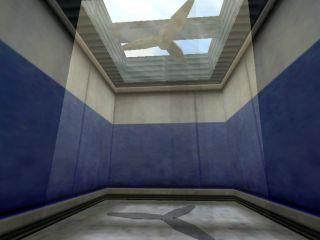
Fan Light Trick

Half-Life HL
Fan Light Trick by Seventh-Monkey
Posted 20 years ago2004-08-09 07:57:16 UTC • Examples • Half-Life
Loading...
Screenshot Thumbnail
Name
Fan Light Trick
By
Seventh-Monkey Seventh-Monkey
Type
Map
Engine
Goldsource
Game
Half-Life
Category
Examples
Included
BSP, RMF/VMF
Created
20 years ago2004-08-09 07:57:16 UTC
Updated
20 years ago2004-08-09 09:41:07 UTC
Views
5002
Downloads
1318
Comments
11
Download

Fakely dynamic lit room with a fan in. I think I read the idea in the Snarkpit.

[updated]

11 Comments

Commented 20 years ago2004-08-09 15:22:20 UTC Comment #3229
sweet, that's all I can say
Commented 20 years ago2004-08-09 16:16:52 UTC Comment #3232
Looks good, its like a non solid func_rotating right? (I cant download at the moment)
Commented 20 years ago2004-08-10 16:27:34 UTC Comment #3249
Very nice.
Commented 20 years ago2004-08-10 21:29:32 UTC Comment #3267
ive had that idea before but never felt like doing it.
Commented 20 years ago2004-08-11 14:57:30 UTC Comment #3283
david: yes.
Rabid: thanks
Commented 20 years ago2004-08-17 10:14:07 UTC Comment #3383
done it before but good job...perhaps it may have looksed slighlty better if you put null texture around the side of the black shadow fan so it doesn't look 3 dimensional :D
Commented 20 years ago2004-09-02 05:34:51 UTC Comment #3760
Good point, I should've done that. Ah well, it's only an example map and people trying this should know that anyway.
Commented 19 years ago2005-06-19 12:37:36 UTC Comment #7828
What????? That is crap!All it is a fan at he top and a small greyish fan at the bottom what a loada crap
Commented 19 years ago2005-06-20 14:21:54 UTC Comment #7854
wow, thanks for this man, I've been trying to make this forever and it kept giving me a fan pain action when i walk into the non-solid rotating.
Commented 19 years ago2005-09-12 16:32:20 UTC Comment #8974
What?s all this crap about this being crap ? Vety creative, looks really good, i think that if the room wasn?t so bright it would look much better...

Nice, really nice
Commented 19 years ago2005-09-12 16:47:50 UTC Comment #8975
Thanks. It would look a lot better darker, on reflection, but it's an example, not a real map :).

You must log in to post a comment. You can login or register a new account.