Lab
- Name
- Lab
- By
-
 Vallian88
 - Type
- Map
- Engine
- Goldsource
- Game
- Half-Life
- Category
- Unfinished
- Included
- BSP
- Created
- 20 years ago2004-08-10 20:43:55 UTC
- Updated
- 20 years ago2004-08-13 11:33:01 UTC
- Views
- 3495
- Downloads
- 776
- Comments
- 9
- Rating
- 3.50 (4)
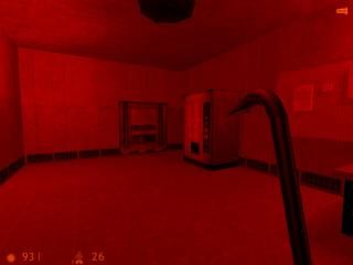
This is my first real work getting back into HL modding. I tried to take in everything I could from all the tutorials. I think I made the rooms too dark though.
Updated v1.1
-Changed lighting
-Narrowed pipe area
-Made the flashlight smaller
-Fixed spelling errors
Updated v1.2
-Added minor details
-Changed some lighting
-Changed a monster
Updated v1.1
-Changed lighting
-Narrowed pipe area
-Made the flashlight smaller
-Fixed spelling errors
Updated v1.2
-Added minor details
-Changed some lighting
-Changed a monster
9 Comments
You must log in to post a comment. You can login or register a new account.

 HL
HL


the rooms are VERY dark, you can barely see your hand infront of you
The flashlight near the dead sci looks way too big
it's almost impossible to get on the pipe to the other
part.
Overall a good level.
GOOD THINGS:
+Nice Architecture
+Game_Text's Used!
+Monster placement isn't over used
+Some attention to detail
BAD THINGS:
-Lighting is poor in some areas
-The pipe at the end, it is nearly impossible to get on it
OVERALL: 4 1/2 STARS
GOOD JOB!!
+ Gameplay is good, balanced, never a flood of enemies or lack therof.
+ Bull board in first room looks cool
+ Some nice detail like the flashlight
Cons
-Lighting! A bit more color and less red would look 100 times better. Darker, in the room at teh end, would look good too.
-Game_text has spelling errors. Not too huge of a deal, but would look good fixed.
-Not too much detail. It shows in some spots, but is bland in others.
-Architecture is very square! May I suggest a look at the detailing half-life textures example maps? Those might help here.
Overall: Off to a good start, but needs some more work.
Rating: ** 1/2.
+Texturing is fairly decent.
+Gotta love the flashlight
+-Architecture is at times great, and at times very blocky.
-Red is very very bright. I say dim the red lights, makes the place a bit darker, and more scary. Make them not so red as well, it looks.... un-natural.
-Monsters are set to scare people. IMO, there are times where they should be hid better. Monsters hid behind crates which I could see and just grenade to death are not scary.
I didn't notice any spelling errors in the Game_text Rabid..
Fun, a tad more tweaking should make this a great map.
3 Stars.
+nice flowing gameplay.
+ok texturing.
+good enemy placement.
+weapon build up.
-lack of scenery(millions of boxes).
-no plot.
3/5