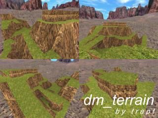
dm_terrain
 HLDM
HLDM
dm_terrain
by
Trapt
Posted 20 years ago2004-08-28 03:13:39 UTC •
Completed •
Half-Life: Deathmatch
"Trapt is back with an all new DM map that will rock your world" - Unknown Source. (Okay, I made that up :D)
Well this is all made using VM, with my very own hands. Or my index finger and my arms to be more exact . I bet you are thinking that I have too much time on my hands...
Credit to the DragonMod Z team for the textures and MulleBoy AND MoiDeux (:D) for testing it pre-release.
Please test it out against some people, I would like to know what could be changed.
-Trapt
UPDATED: Added healthkits and now less places to get stuck.
Well this is all made using VM, with my very own hands. Or my index finger and my arms to be more exact
 . I bet you are thinking that I have too much time on my hands...
 Credit to the DragonMod Z team for the textures and MulleBoy AND MoiDeux (:D) for testing it pre-release.
Please test it out against some people, I would like to know what could be changed.
-Trapt
UPDATED: Added healthkits and now less places to get stuck.
12 Comments
You must log in to post a comment. You can login or register a new account.


As I said, looks nice, although texturing is somewhat boring and could use some tweaking too, like the edges between grass and rock, and the stretched textures. Some tree's and such would be nice too, maybe a beach or something as it looks tropical for some reason. It's bright, yes, and I like it.
With a decent layout this style can make up for some good fragging, especially the vertical variation.
The double (or triple) Hguns kind of annoyed me, maybe thats just 'coz I got pwned by them so much though ;).
On a scale from 1 to 10...
Grpahics: 10, very good use of the VM tool and had nice geometry. It really did look like a big rocky place.
Lighting: 6, a little bright and non-ambient. adjust the angles of light_environment to make shadows and such.
Variety: 8.5, I liked the way alot of the rock formations came together with rock arches and cliffs.
Ambience: 2.5, could use some sounds and echo effects to lively it up. But the area matched the sky texture very well.
Playability: 9, Very fun to play HLDM on it. Lotsa weapons and etc. but the clipping problem needs to be fixed.
HINTS: Use the "clip" texture to smoothen out clipping problems. fill little crack and crevices with a block that is textured with the "clip" texture. Use the point entity "ambience_generic" and add the sound "ambience/crickets.wav" or "ambience/crickeet.wav" to add ambience. Then use "env_sound" and pick a nice echo effect for the map. Round off the squareness of the map and you could place the setting on a big rock bluff or something. so when you fall of the side, you fall to your doom. Just some advice from me.... Overall 4 stars!!!