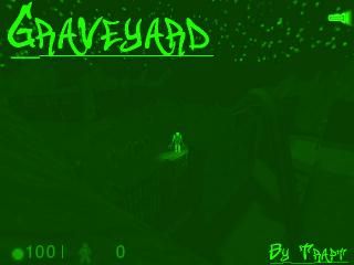
Graveyard v0.2
Ok, here is version 0.2. Here are some things added from the previous version:
-New sky with full moon
-Better lighting in the graveyard
-An open grave with a skeleton in it
-Now with music and ambience.
Have fun, and please comment!
For WON users, music works with HL cd in only. For Steam, the CD is not needed. I don't think. :/
-New sky with full moon
-Better lighting in the graveyard
-An open grave with a skeleton in it
-Now with music and ambience.
Have fun, and please comment!
For WON users, music works with HL cd in only. For Steam, the CD is not needed. I don't think. :/
13 Comments
You must log in to post a comment. You can login or register a new account.

 HL
HL


/me looks at Anonymous.
You know one thing that's always bothered me about this map? The pub scale. The ceiling is extremely low...maybe raise it a bit if y'could.
anyway since i was "asked" to come here and rate this, i will.
+ the fence looks good.
+ nice sky
- the grave stones look like crap. they don't look like real tombstones and are mostly just coppied and pasted. try to vary them (size and shape) and maybe use textures with some writing on them to make them more realistic.
- the streetlamp models allow the player to walk right through them, but block the player in other spots where there appears to be nothing.
- you used cyclers for the skeleton models so they sit up when you crowbar them... looks crappy, fix it.
- the skeleton model that's in the grave blocks the player from getting down there... i think that's what rabid mentioned.
- killing 50 monsters in a row with a crowbar has been done so many times before and gets old quick.
- the headcrab in the dark confined area is pretty played out too.
- the wreckage in the pub and the pub itself look generic as hell. too blocky and too little detail.
- the collumns in the basement look really bad. i don't know what you were trying to do with them, but they look really bad.
- that whole area looks too contrived... like you just put stuff in there for the sake of having something there.
that's all that i remember that got my attention. if i think of anything else i'll add it later.
as it is now, 2 stars.
It was Rabid getting the rating back to what he thought it should be after a certain dickhead voted it one star multiple times.
Now, you are doing the same thing to me that you are doing to PaLO's maps. You are making complete bullshit negative crap to put on there, just because of the fact that you don't like me.
Here's my message: If you don't like me, fuck off, don't play my maps, and get the fuck off this site.
and no need to swear and accuse because i think your map is 2 stars. i really don't see why you continue to attempt to instigate me. even before i gave your map 2 stars you've been following me around and insulting me. now that's no way to behave...
Also, most others said the things you put as negatives were great. For example, most people like the basement. Another example: People saying that killing the zombies was great fun, not "old".
How can wreckage look generic? And undetailed? Its a fucking flat roof, the wreckage is going to be fucking flat as well.
Too contrived? Wtf else do you see in a pub basement? Columns, pipes, vents, and those wine holder things.
Seriously......
Anyway, enough of the bullshit, I thought your map is an excellent start. I like the atmosphere, great textures too.
Maybe you should extend the graveyard and add lots of trees. I for a fact you can get tree models in the Snarkpit (instead of mapping them). The blacked-out areas should go in deeper perhaps, or lead to other regions.
I was going to put in some models, but it would look weird for WON users because of the transparency dlls.
Unless there is tree models which don't need transparency
I'll see what I can do, I'll make a decision some time soon about whether to use tree models.
+ dont listen to other ppl who moan so much its your map its what you want.
lighting is good , arcutecture is good YAY
5 star!
As my old dad used to say:
"Sometimes if you pee on it, it stops the stinging"
wait...wrong quote