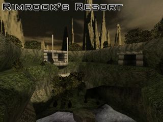
Rimrook Resort
 CS
CS
Rimrook Resort
by
Rimrook
Posted 19 years ago2005-04-18 20:38:14 UTC •
Completed •
Counter-Strike
- Name
- Rimrook Resort
- By
-
 Rimrook
 - Type
- Map
- Engine
- Goldsource
- Game
- Counter-Strike
- Category
- Completed
- Included
- BSP, RMF/VMF
- Created
- 19 years ago2005-04-18 20:38:14 UTC
- Updated
- 19 years ago2005-04-18 20:38:14 UTC
- Views
- 3943
- Downloads
- 1067
- Comments
- 11
- Rating
- 5.00 (1)
- Reviews
- 0
A belated submission, but it's here!
This is my resort map in final. The wad file and rmf is included incase anyone wants to mess it up.
~Enjoy
This is my resort map in final. The wad file and rmf is included incase anyone wants to mess it up.
~Enjoy
11 Comments
You must log in to post a comment. You can login or register a new account.


+Waterfalls look beautiful
-When you exit the waterfall area by the window-like 45? angles, there should be some clipping, unless there is a reason to be down there in no-mans land i'm not aware of.
-A little too dark IMO.
-There is no whiskey or wine anywhere at this resort.
-There are no front desk squires or resort toadies anywhere on this map who I can bitch to about the bad customer service...<sorry, my caffiene buzz is peaking>
Nice job overall!
+1000pts
Some minor tweaks for future maps (I hope you wont give up mapping because of college): try to keep all textures with the same X and Y proportions at all times (building with the grid helps)
Dont use the same texture on the floor and a wall if they are together :'(
Great map(s) Rimrook
Great job Rimrook, it so sad to see you leaveing, came back and outdo the insignificants sometime in the future.
I might not get around to updating this, that's why there's a wad and an rmf in the zip. So if something doesn't work right or could use some tweaking, go right ahead and do it