Multi-Level-Player
 HLDM
HLDM
Multi-Level-Player
by
esmajor
Posted 19 years ago2005-04-23 00:54:52 UTC •
Unfinished •
Half-Life: Deathmatch
- Name
- Multi-Level-Player
- By
-
 esmajor
 - Type
- Map
- Engine
- Goldsource
- Game
- Half-Life: Deathmatch
- Category
- Unfinished
- Included
- BSP, RMF/VMF
- Created
- 19 years ago2005-04-23 00:54:52 UTC
- Updated
- 19 years ago2005-04-23 00:54:52 UTC
- Views
- 1680
- Downloads
- 596
- Comments
- 8
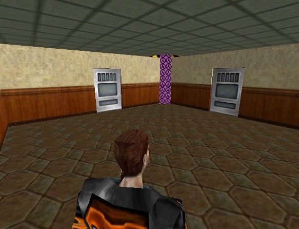
Okay I decided to submit this as a multiplayer map. Yes I know it needs work, but I'm wondering if any of you could give some insight as to WHERE IN THE MAP to place various spawns. Cuz I sure don't know how to place even # of spawns for me and other players.
This is going to be a deathmatch type map (every man for himself)
If you look carefully you will notice the ladders are placed staggered between each level.
Ratings, suggestions, and uploaded ideas would be GREAT!
TIA!
This is going to be a deathmatch type map (every man for himself)
If you look carefully you will notice the ladders are placed staggered between each level.
Ratings, suggestions, and uploaded ideas would be GREAT!
TIA!
8 Comments
You must log in to post a comment. You can login or register a new account.


The spawn points is what concerns me - what ENT am I using? info_player_deathmatch ?
It's a very good thing that you have very low r_speeds. But if you're going to turn this map into an office this is going to change. And with this ladder setup and doors on every side they are surely going to be rocketed up to something like 700-1000 wpolys (wich isn't good for a multiplayer map).
You're in a very early stage of development so you can add pretty much anything to the map. I've attached an example layout which allows the map to be anything, not just office. It's made of blocks, just to show you where to put the corridors. Here's the legend:
AAATRIGER is for rooms (where you put the good stuff)
CLIP is for corridors (where you have windows, looking at the middle area)
SKY is for the middle area (which is only accessible from the top
RED is for the top arena (where you have mass murders :-] )
And a tip for start locaion placement: Put the ladders away from the doors and the walls. Then make a solid column next to the ladder and let the players start behind it. This way they won't die the second they spawn and at the same time will be close to the action.
This is only an example layout, you don't have to follow it to letter. Just make sure you change either the door or the wall texture, cause they don't mach very good.
-face splitting in the narrow hallways
+nice lighting
To answer you, Nobody made me 'screenshot king', and whilst were being offensive, I'll tell you this now; Uninstall hammer.