regen
 HLDM
HLDM
regen
by
rend0us
Posted 19 years ago2005-04-27 13:31:06 UTC •
Completed •
Half-Life: Deathmatch
- Name
- regen
- By
-
 rend0us
 - Type
- Map
- Engine
- Goldsource
- Game
- Half-Life: Deathmatch
- Category
- Completed
- Included
- BSP
- Created
- 19 years ago2005-04-27 13:31:06 UTC
- Updated
- 18 years ago2006-07-28 23:10:12 UTC
- Views
- 2771
- Downloads
- 873
- Comments
- 10
- Reviews
- 0
UPDATED LINK..
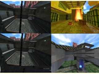
I been getting cought up with detail. I keep getting comments from players about the rooms needing to be larger for death match fighting.
I guess i been too worried about detail than size of the areas. Any comments or ratings help a lot, ty all...
I been getting cought up with detail. I keep getting comments from players about the rooms needing to be larger for death match fighting.
I guess i been too worried about detail than size of the areas. Any comments or ratings help a lot, ty all...
10 Comments
You must log in to post a comment. You can login or register a new account.


This map needs:
-Like you said, larger and more isolated areas. Blending rooms with each other is nice but has to be done very carefully to avoid creating confusion.
-Less textures. Although most of them are nice, many of them seem a bit out of place. It can also make the map look confusing and some people (not me) can think that the map is a showcase for your custom textures.
-Some surroundings. There are places where the map ends in a severe way, like the world beyond was gone. Some sections outside the playable area will make any map more beleivable.
-Less pointlight entities or a lower brightness on them. Fire and lava have a softer light (I havent been to many lava places but it's just a guess
-Some null textures!! no need to explain this one
-As in previous maps, that "something" that holds the map together (structure, a certain texture scheme etc)
-More constructive criticism like this XD
+Nice use of fire sprite
+Nice job on the fan-lift!
+Nice Hidden teleport.
I don't really know what else to say about this map, except that I thought it looked good, and it's missing a couple things I can't put my finger on.
Nice job!