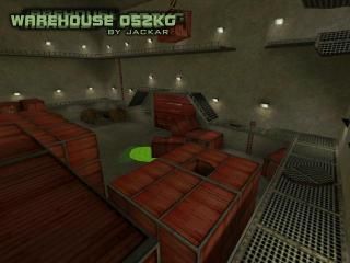
Warehouse 052KG
 HLDM
HLDM
Warehouse 052KG
by
Jackar
Posted 21 years ago2003-06-29 13:31:12 UTC •
Completed •
Half-Life: Deathmatch
It`s a medium arena map for 4-8 players. It is situated in abandoned warehouse.
You can get more info on site:
http://thelambda.d2.cz/warehouse_052kg/
Please, give your ideas, critics, bugs, etc...
Thank you.
You can get more info on site:
http://thelambda.d2.cz/warehouse_052kg/
Please, give your ideas, critics, bugs, etc...
Thank you.
2 Comments
You must log in to post a comment. You can login or register a new account.


I can see why Hint brushes might not have worked, but I read an article on Collective from Jeff Pritchard about Horizontal Hint brushes, have you tried that? Also, if you made the bottom of all the containers into func_entities you might save some count.
Either way, R_speeds or not, I like it.
The layout is not too bad, considering; it could use some more ways to get up towards the top of the map, though. All in all, not a bad effort.