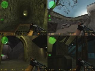
de_explosivo
 CSS
CSS
de_explosivo
by
Playbus
Posted 19 years ago2005-05-29 06:57:05 UTC •
Completed •
Counter-Strike: Source
- Name
- de_explosivo
- By
-
 Playbus
 - Type
- Map
- Engine
- Source
- Game
- Counter-Strike: Source
- Category
- Completed
- Included
- BSP
- Created
- 19 years ago2005-05-29 06:57:05 UTC
- Updated
- 19 years ago2005-07-19 06:41:41 UTC
- Views
- 3119
- Downloads
- 981
- Comments
- 4
- Reviews
- 0
A fun map for CS: Source, which I made for my clans' server. Not a terribly realistic setting for a map, but that wasn't really my aim.
This is the first map I've ever done for Source, it is a very loose remake of one I did for CS 1.6 ages ago.
I'm still very much a novice at mapping, but I am pleased with this map because it taught me an awful lot while making it.
I'm happy with the layout, and I quite like the lighting even though I have a feeling you're all going to rip into me for it.
Suggestions and comments welcome.
PS Bots don't work well, Feel free to fix the NAV
This is the first map I've ever done for Source, it is a very loose remake of one I did for CS 1.6 ages ago.
I'm still very much a novice at mapping, but I am pleased with this map because it taught me an awful lot while making it.
I'm happy with the layout, and I quite like the lighting even though I have a feeling you're all going to rip into me for it.

Suggestions and comments welcome.
PS Bots don't work well, Feel free to fix the NAV
4 Comments
You must log in to post a comment. You can login or register a new account.


Anyway looks good and i'll review now:
Not much to say except it's a nice map, a few textures in that tunnel are misaligned and the lights in that tunnel are weird looking.
Apart from all that what theme is this! It's really weird!
I had fiddled with the NAV a bit manually -- it still sucks ass, but you should've seen how bad the pure auto version was -- the T bots wouldn't ever leave their spawn point, and the CT's spent all their time jumping up and down in the water room!
I've spotted a few texture bits I'm going to correct at some point, and when playing this on the ole clan server we found one place where it's easy to get stuck, I'll have to sort that out too. It played pretty good online, but almost everyone said they found the layout confusing at first. After half an hour, everyone was having fun.
The theme, well it's named after one of my clanmates, and it really doesn't have much of a theme. I built a map to teach myself a bit more about hammer, I made loads of rooms and connected them together. I practised displacements in the corridors and stuff. This is just what I ended up with eventually.
Yes I got stuck in places and I don't blame the bots because the map is like an assault course... You have to duck, jump climb and it's crazy!
Good map none the less.