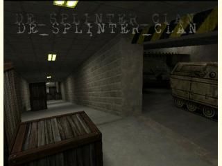
de_splinter_clan

Counter-Strike CS
de_splinter_clan by Archie
Posted 19 years ago2005-07-30 09:21:13 UTC • Completed • Counter-Strike
Loading...
Screenshot Thumbnail
Name
de_splinter_clan
By
Archie Archie
Type
Map
Engine
Goldsource
Game
Counter-Strike
Category
Completed
Included
BSP
Created
19 years ago2005-07-30 09:21:13 UTC
Updated
16 years ago2008-11-13 11:06:44 UTC
Views
8736
Downloads
2037
Comments
19
Rating
4.33 (6)
Reviews
0
full star full star full star full star half star Download

Decent layout - badly executed.

Try de_splinter2

19 Comments

Commented 19 years ago2005-07-30 09:26:51 UTC Comment #8326
I remember this map, it was a legend of a map!
So whats the fixes?
Commented 19 years ago2005-07-30 09:28:31 UTC Comment #8327
not neraly as many black 'lines' down the cliffs. Removed annoying null textured brush that allowed players to see through wall in bombsite B..
ummm.. fixed the tank with an invisible ass.

Improved lighting... Re-aligned crates in T spawn.. umm... the usual stuff..
Commented 19 years ago2005-07-30 16:39:09 UTC Comment #8331
I've downloaded this twice now, and both times I get

"de_splinter_clan.bsp is not a valid BSP file"

Fix it!
Commented 19 years ago2005-07-30 17:27:05 UTC Comment #8334
what do you mean 'fix it' ?
it works for everyone else who has played it!

you do know this is for CS 1 .. not source
Commented 19 years ago2005-07-31 05:27:14 UTC Comment #8339
Hunter, that is one damn good map. I could definately see myself playing this (if only steam would work for me) Its brilliantly designed and the gameplay would certainly be one of this maps strongest points. Your work wa not in vain, well done!
Commented 19 years ago2005-07-31 06:39:54 UTC Comment #8340
snorfle thats the nicest thing anybody has ever said about one of my maps collapses in a seizure
Commented 19 years ago2005-07-31 18:03:59 UTC Comment #8356
It really good. Wish it as for source though...
Commented 19 years ago2005-08-01 03:35:49 UTC Comment #8365
Haha, ok sorry, my bad, I thought it was for source. I'll review after work tonight.
Commented 19 years ago2005-08-01 09:43:51 UTC Comment #8371
Well - let the reviewing begin! :)
Dling...
Commented 19 years ago2005-08-01 09:48:31 UTC Comment #8372
Well It's pretty good, but it still needs the following:
-Ambient sounds
-Breaking bomb targets
*************************
And other things I've noticed...
*************************
-You created the APC with vertex manip.? Coz theres a invalid solid in it's back...
********************************
Good stuff
********************
+Cool Gameplay
+Good layout
+Normal texturing
********************
It's better than the first one, but it still needs work... :)
Commented 19 years ago2005-08-01 09:49:26 UTC Comment #8373
4/5
Commented 19 years ago2005-08-02 04:42:32 UTC Comment #8391
Are you sure you didn't use the old version :S
Commented 19 years ago2005-08-02 12:55:35 UTC Comment #8399
+ Good Layout
+ Nice Cliff Architecture
+ The indoor bombsite is nice
+ Nice lift (not so good if you get stuck on top of it though)

Lighting was plain, but fine. Doesn't deserve either a + or a - for that.

- Texture on the cliffs outside, looks out of place to me
- There's a stepladder that doesn't go anywhere -- but you can get stuck behind it if you climb it.
- The room containing the four identical huge blocks with the godawful mis-aligned crate texture on them, that was a bit crap.

Nice job, I've given four stars.
Commented 19 years ago2005-08-03 09:32:32 UTC Comment #8409
you cant get stuck on the lift.. tyhere is a hole in the roof..
Commented 19 years ago2005-08-06 18:10:19 UTC Comment #8476
It kills you though right?
Commented 19 years ago2005-08-07 05:57:32 UTC Comment #8481
..um.. only if you stay on the roof.

btw, i know about the ladder. its on purpose. and you can get out the other side.. just takes ages... its to try to prvent campers from camping on the ladder
Commented 19 years ago2005-09-02 19:36:12 UTC Comment #8830
Nice!
Commented 19 years ago2005-11-04 15:02:19 UTC Comment #9721
-textures are misaligned in a few places, one being the bomsite helipad thingy.
-There are 'ledges' everywhere where rooms/hallways meet. Looks pretty bad.
-the metal elevator doors open with a creaky wood sound ?!?!?
-needs more ambient sounds maybe a blowing snow outside, and some industrial sounds inside.

+great, interesting layout
+Nice overall brushwork in most places
+love the partially contstructed tanks! Didn't you have the turret of a tank hanging from a cable gangway on the last map? If you didn't, you should ;)

This map has 5-star potential, but it's certainly not there yet.
Commented 19 years ago2005-11-04 15:17:25 UTC Comment #9722
Could also do with more fine detail props imo, pretty much everywhere.

You must log in to post a comment. You can login or register a new account.