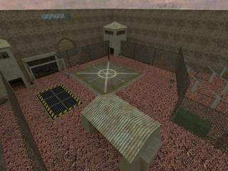
Top Secret
- Name
- Top Secret
- By
-
 Fragmeister
 - Type
- Map
- Engine
- Goldsource
- Game
- Half-Life
- Category
- Unfinished
- Included
- BSP
- Created
- 19 years ago2005-09-15 17:01:09 UTC
- Updated
- 19 years ago2005-09-28 09:49:07 UTC
- Views
- 2540
- Downloads
- 692
- Comments
- 12
- Rating
- 2.00 (1)
This is an underground lab style map, sp, and obviously unfinished. The basic story: There's an underground lab, that does top secret research, and that's all anyone knows. There were rumors of an accident, something going wrong, and the military was sent in, but the ones who actually went in never came back. Your organization wants the truth, and you have to fight your way past the grunts, make it in, and find out the truth.
12 Comments
You must log in to post a comment. You can login or register a new account.

 HL
HL


What direction are you heading with this map? It's unfinished and I can't really think of what you're planning for this map...
Anyway. Some things you should definitely improve on are the bunker inside (bunkers with couches? and what are those bleu blocks supposed to be?) and the bunker entrance (I'd expect a fortified crete structure but this thing has thin walls and a really light roof. Not very well protected).
The base also lacks a noticeable entrance. Adding a road will help.
Also, do something to make the map feel more real, as the skybox is quite distinguishable from the level itself. Perhaps use some rocks or such.
Nice secret grenades though, and that generator with solar panels looks like a good idea. Tweak them a bit and it's a nice setting.
The part with the couches is a "waiting room" so to speak. the real level will be far below, and because this is sp, there'll probably be a map change somewhere in there. (you'lll see.) the "entrance" is the helipad, but like you said, a road would be good. I'm in the process of fixing the skybox problem, and i'm glad you could actually tell that those things were solar panels!
I know it's a waiting room. But that doesn't really fit in a bunker (unless it's a dictators bunker - this seems more like a field bunker).
********
Good stuff
********
- You had a sort of puzzle going on
- And elevator

- The solar panels were nice
- Outside was sort of realistic
********Bad stuff
********
The wall blocks the solar panels from receiving any light. Pus that a wall suffices, no need for the fences anymore. Also, I could get stuck between the walls and the fences (odd turret placement there too, they didn't even work too).
Pressing buttons in guard towers to open a bunker access door doesn't make much sense to me. Oh, and let the player know what happened. The purpose of those buttons is unclear, you can't see what they do. They appear to do nothing when you press them actually.
The lighting is ugly. But I suppose you'll change that in a later stage.
The elevator is boring (it's slow and it's a long way down. Don't waste the players time, at least give him some interesting things to look at), and it doesn't fit well in it's environment. Why have a large cargo elevator when there isn't even room for such large cargo there? Those rooms are too small for that. Doesn't feel right.
Dark room, too bright glass, painfully flickering light and a bunch of zombies together with barney's? I'm not sure what to make of that but it's no good at the moment.
Conclusion: some improvements were nice, but there's still a lot to do. Don't forget about logic: several things in your map don't feel right. Why? Compare them to the real world: would they be done like that in reality?
For example, buttons are usually labeled to make their purpose clear. Buttons that control security doors are usually placed in security offices.
So... good luck with it!
Turrets: need to add a trigger
buttons: wierd lighting effect, will fix
elevator: again, will fix soon
the big room: I just haven't added lights yet.