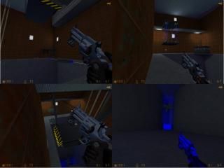
Deus Ex Machina
 HLDM
HLDM
Deus Ex Machina
by
gordonfreeman
Posted 19 years ago2005-10-22 12:40:55 UTC •
Completed •
Half-Life: Deathmatch
- Name
- Deus Ex Machina
- By
-
 gordonfreeman
 - Type
- Map
- Engine
- Goldsource
- Game
- Half-Life: Deathmatch
- Category
- Completed
- Included
- BSP
- Created
- 19 years ago2005-10-22 12:40:55 UTC
- Updated
- 19 years ago2005-10-22 12:40:55 UTC
- Views
- 2781
- Downloads
- 671
- Comments
- 5
- Rating
- 3.00 (3)
- Reviews
- 0
gf_deus_ex_machina - HL1DM for 2-6 players.
Be sure to check out everything!
Please download, rate and comment.
Be sure to check out everything!
Please download, rate and comment.
5 Comments
You must log in to post a comment. You can login or register a new account.


Also, add more cover to hide behind.
A good one
What you should change:
Texturing. Scale upt the textures on the big walls, they look very pattern-ish.
Architecture. It's alright, but the map lacks of detail.
Gameplay. Do as Hunter said.
Ambience. Some ambient sound would be quite nice.
+Interesting layout.
+Neat construction in places.
The rest didn't leave an impression on me, which is to say this definitely needs more work, and doesn't belong in the 'completed' section imo.
4 stars Hunter? In what universe?