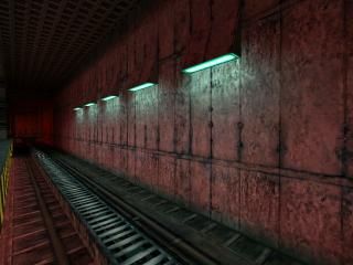
Train
- Name
- Train
- By
-
 theonering
 - Type
- Map
- Engine
- Goldsource
- Game
- Half-Life
- Category
- Unfinished
- Included
- BSP
- Created
- 19 years ago2005-10-28 13:21:18 UTC
- Updated
- 19 years ago2005-12-02 15:40:51 UTC
- Views
- 1996
- Downloads
- 657
- Comments
- 13
Ok I'm quite new to mapping, so don't be too harsh!!
Anyway please tell me what you think, I've almost run out of inspiration...
NB: when the train stops at the end, and the lights go out, DON'T GET OFF but look up!
EDIT: should be fixed now.
EDIT: now it really should be fixed...
Anyway please tell me what you think, I've almost run out of inspiration...
NB: when the train stops at the end, and the lights go out, DON'T GET OFF but look up!
EDIT: should be fixed now.
EDIT: now it really should be fixed...
13 Comments
You must log in to post a comment. You can login or register a new account.

 HL
HL


i tried to include it, but its too big... oh well. i just cut out the textures in the end.
Arcututure is impressive!
Keep up the good work. Later I'll do a full review...
I busy now! (gmod 9)
-DrMapper
I think you need some more detail into the map like hand rails on the train , and when the train goes up it just floats and id put the place where you get off the train closer to it to make it look more realistic.
Boring blocky architecture.
+Nice door at the beginning, albeit somewhat blocky.
-Other doors I would recommend using -lip on the doors so you don't see that weird brush overlap.