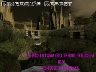
RimResortHLDMvDD
 HLDM
HLDM
RimResortHLDMvDD
by
Dizzy Devil
Posted 19 years ago2005-11-10 02:51:25 UTC •
Completed •
Half-Life: Deathmatch
- Name
- RimResortHLDMvDD
- By
-
 Dizzy Devil
 - Type
- Map
- Engine
- Goldsource
- Game
- Half-Life: Deathmatch
- Category
- Completed
- Included
- BSP
- Created
- 19 years ago2005-11-10 02:51:25 UTC
- Updated
- 19 years ago2005-11-10 02:51:25 UTC
- Views
- 2553
- Downloads
- 845
- Comments
- 9
- Rating
- 5.00 (2)
- Reviews
- 0
This was a fun map to redesign. What a pleasure to redesign a CS level to HLDM. Especially one of Rimrook's.
I cannot full credit. Rimrook did an awesome job with the original.
I did change and add a few things to it.
I loved the light fixtures that Rimrook had made and I did not feel the they where getting enough attention. I added a light entity to all fixtures and matched the color that that light would have given off.
2 added rooms.
The first was because the big stone blocks the Rimrook had against the wall by the water falls. I have seen several CS maps that have them but they do nothing or lead nowhere.
I changed them to doors and added a room behind them. It turned out very well.
The second was under the stone second level by the neat spiral thing next to the circular window. Rimrook?s tribute room is within the stone floor/box.
There where some places I had to add a Trigger hurt to kill the player so the player was not running on the skybox.
Added a clip texture to the top of the "courtyard" and little pool. This would have been a great place for snipers but the sky texture was "bleeding" in to the other rooms around the area. So played it safe and clipped the top area so that no one can Gauss jump or walk on that ledge.
Thank you for the opportunity to redesign this level RIMROOK!!!
9 Comments
You must log in to post a comment. You can login or register a new account.


This level uses vertical combat nicely and has some good connectivity I think, it's not hard to learn either. 5 minutes is enough to understand the layout which is just fine. It's not uber detailed but the overall structure feels fitting together good and that may have more impact than extra little thingies all around. Good job here.
But uhm, the waterfalls had some uber-bright glow sprites underneath them... the smoke sprite messed up or such? Looked strange. And you used those green plants as ladders at some point but at another point they were just decoration. That's inconsistent and I just had to try to climb them but nope, they weren't climbable. Perhaps use a different plant texture there to avoid confusion.
Overall, a good-looking map with a nice, a little abstract, style to it and it looks like it has some good vertical combat. Good stuff.
I never noticed the sprite thing, i wonder how that happened. <.<
Sorry.
+ Texturing was great too. I liked the costum textures and they were well aglained.
+ Lighting was good. Not too bright and not too dark, there is contrast too, between darkness and bright mostly but also a bit between colors.
+ Terrain work a bit strange but I liked it, it fits well with the theme of the map.
+ Layout is great. Easy to learn, although it's complex, lots of vertical fights which is great. A bit big so it's a bit hard to find enemies, but it's not so bad.
+ Gameplay is great. It's was so fun to play it. Lots of space, but few cover... It's also great cause of the great layout.
+ Not too many ambience!(can get annoying sometimes in deathmatch) You used it only when it's truly needed
+/- Weapon placement was ok. The ammo isn't too close to the weapons ,but do you think you should place a long jump model right on the brige thats in the middle of the way?
- Why did you add the glows to the water below that brige? They are complitly useless and out of place. And the glows below the water fall are too bright, they destroy the whole atmosphire of that room. I liked that room, but those glows ruin it. Try the ballsmoke.spr instead.
Over all it's a great map. I really like rimrooks maps. I think your modification is great.