The Unteenth Test Chamber
 HL
HL
The Unteenth Test Chamber
by
chris666
Posted 19 years ago2005-11-12 06:33:09 UTC •
Completed •
Half-Life
- Name
- The Unteenth Test Chamber
- By
-
 chris666
 - Type
- Map
- Engine
- Goldsource
- Game
- Half-Life
- Category
- Completed
- Included
- BSP, RMF/VMF
- Created
- 19 years ago2005-11-12 06:33:09 UTC
- Updated
- 19 years ago2005-11-12 08:15:22 UTC
- Views
- 1980
- Downloads
- 670
- Comments
- 7
- Rating
- 4.00 (3)
- Reviews
- 0
12 hours of mapping. I made for contest but had bad wads so its fixed now. It's certainly not great but I had fun nevertheless.
7 Comments
You must log in to post a comment. You can login or register a new account.


****************
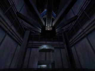
+ Architecture. The test chamber was great. Nice detail, rotating stuff. I also liked the glass elevator and overall detail. There were some flaws, but they were only minor.
+ Texturing. The wall textures were super-stretched, although they didn't seem unnatural, which was a surprise. Some textures weren't very natural, like the ones on the rotors.
+ Lighting. I liked it. Not too bright in the test chamber, and bright enough in the labs. The lighting in the room after the disaster was also good. I liked the red-ish theme.
****************************
- Ambience. Some beam sounds, a louder rotor sound would have been very good.. The large test chamber could have had an ambient sound too. I'd recomment mechwhine.wav or industrial1.wav. You could also add some env_sound to make the ambience really sound like in the huge test chamber.
*********************
Overall - a good map. It only lacked atmosphere, and that's quite important for a test chamber.
The ending was somehow boring, you could have something happen then.
Good work.
The test chamber is very big, but generally doesn't seem blocky or un-detailed, largely thanks to good texturing. The control rooms seemed well-scaled and the lift ride itself was nice (even if it was a bit difficult to get in and out). The sequence is long and dramatic.
There were some little architectural bugs, and I saw distinctive signs of carving when I ran in wireframe. It ran fine still, but I would suggest that you read all the Intermediate tutorials, especially the more general ones. Trust me, it works.
The sounds were a bit lacking, but it was nice to have music, which only one of the other entries featured ? and it was an ideal situation to use the HL soundtrack.
I agree with Daubster on the slightly anti-climatic ending. No Gman in a red suit to lead you away? A missed opportunity
Above-average for a map, and good for a competition entry. I'll be generous and give it four stars.
I cant say the same for brushwork though...
I liked the large size of the chamber and the "machine." Good use of rotating entities and lasers/beams.
Big minus on the elevator, however. I tried to open the elevator door when I entered and, because the button was close enough, the elevator rose up. Also, I got stuck (unless it was part of the sequence) near the top of the elevator and had to move around a bit before it completed its journey.
Suggestion: make the elevator bigger; use clips to keep the player from getting stuck; either place the button where it can't be triggered from outside the elevator or use a trigger brush to trigger the elev when the player enters the elev.
Good effort. It would make a good addition to a bigger map.
Design of the chamber was original and inventive in many ways. Nice Job!
Nice use of ambient sounds and music, which many people omit.
Little flaws all over, but my general impression was that this is a very well constructed piece.
I liked your version of hell at the end.
Little things I remeber:
-Elevator needs some help.
-clearer idea at the beginnig of what you're supposed to do, might do.
-If you got some scientists and a barney in there, would be cool. as well as gman and/or some monsters at the end like 7th said.
For the sequence itself, how nice it looked alone, i'm going 4-stars.
Really nice Job!