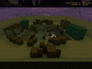
fy_dig
- Name
- fy_dig
- By
-
 n00b #2
 - Type
- Map
- Engine
- Goldsource
- Game
- Counter-Strike
- Category
- Completed
- Included
- BSP
- Created
- 19 years ago2005-11-28 10:10:44 UTC
- Updated
- 19 years ago2005-11-28 10:10:44 UTC
- Views
- 1811
- Downloads
- 520
- Comments
- 10
- Rating
- 2.50 (6)
- Reviews
- 0
Sorry...here it is again..i didn't include the wad file.
It's a pretty fun map when we played it on my clan server.
Btw, this is one of my first maps too so have fun with it and go all out on the ratings.
I gotta hurry I'l update this description once i get back from school or I'll do it at school today
It's a pretty fun map when we played it on my clan server.
Btw, this is one of my first maps too so have fun with it and go all out on the ratings.
I gotta hurry I'l update this description once i get back from school or I'll do it at school today

10 Comments
You must log in to post a comment. You can login or register a new account.

 CS
CS


Pros: Basics. Cons: Design, design, design. Don't let this score dishearten ya, you have the gameplay basics part down IMHO, you just need to work on aesthetics and brush alignment. You may want to consult 3 really great tutorials here on TWHL, the Dimensions one, and the Vertex Manipulation tutorials.
BTW i didnt know what else would be at a digging site besides crates for storage but yea...i know those barrels were a bit big but I didnt care.
but to think this map came out of nothing. it first started as a ka map where you only went into the pit but then the fy idea came up.
but I know how to make pretty good gameplay.. somethign I have a knack for
but I will keep up my work and do know that each map I make is just me learnign more and more at a time.
Fairly nice map, pretty amazing for your second map really(he made a ka_ map before this, I know because I'm psychic).
Haven't tested it with real people yet but I'll go ahead and give it 3 stars.
btw its not just music from blahhh but its radiohead idioteque
Don't post double-posts, please. - Daubster
hmm..you should put this map on your server man.
Hmm..I'm wondering what theme I'll use on my next map. any ideas people?
The screenshot kinda says it all...
Architecture (-) very very boxy... and i sense carve tool usage! prefab usage, i believe... boring, really...
Lighting (+/-) Meh. The lighting kinda suits the map but its nothing special.. not perfect...
Gameplay (-) Too small for a proper game... dull..
Textures (-) Really badly stretched in places... repetative. i think you're a little bit 'fit to face' button happy.
Overall (-) Very small... Filled with crates. Un-imaginative. Boring...
+/- Weapon Placements, you had a few stronger ones hided, yet, a m4a1 and a scout on the 2 boxes in front of spawn??
Somebody could just get that m4a1 very fastly, while this is one of the very strong weapons, I think you should have put that gun in the middle of the field like the aug and sg-551 (that's the name?).
+/- Lightning, it suits the map but it's kinda dull..
- Texturing, bad, very bad. Repeated, Stretched and badly aligned.
- Architecture, meh, blocky stuff with al the crates in it.
- Gameplay, would probaly suck because there are to many objects in such a small area.
- Lay-out, fy_pooldayish..
2.5, yet, I don't think it deserves a 3 star..
+Nice music Raidohead Idioteque <3
-large absense of ambience elsewhere
+Great buried things and crumbled archaeological structures
-maybe add some digging tools, and some aztec-style lights for the dig
-some stuff scaled crazy big outside
-sand dunes above could be more creatively constructed
+good weapons placement
This is well done, especially for a beginner map, but still much room for improvement.
Looking forward to seeing more material from you!
3 stars