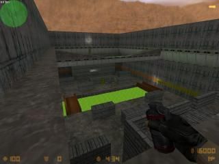
dorian27_fort
 CS
CS
dorian27_fort
by
Dorian27
Posted 19 years ago2005-12-03 21:03:00 UTC •
Completed •
Counter-Strike
- Name
- dorian27_fort
- By
-
 Dorian27
 - Type
- Map
- Engine
- Goldsource
- Game
- Counter-Strike
- Category
- Completed
- Created
- 19 years ago2005-12-03 21:03:00 UTC
- Updated
- 19 years ago2005-12-08 21:52:22 UTC
- Views
- 4005
- Downloads
- 686
- Comments
- 8
- Rating
- 4.00 (3)
- Reviews
- 0
My friends made up a map design on a piece of paper at school, so I decided to make it. I elaborated on some of their ideas. This is an Aim map with M4A1s, there are 2 bases. Up to 16 players at a time, but it gets hectic.
Use the retard button!
**Updated - No more stupid ditches, more spawn points, new secret room, no misplaced weapons, new sky, more explosive barrels.
Use the retard button!
**Updated - No more stupid ditches, more spawn points, new secret room, no misplaced weapons, new sky, more explosive barrels.
8 Comments
You must log in to post a comment. You can login or register a new account.


I bet some of you are wondering why there is a random shooting range.. my friend is new to CS, and he wanted something to practice on.. so thats why..
If anyone else has comments keep them coming..
btw this map took ~approx 5 hours to make.
things u should consider
- darker looking sky
- make the acid inflict damage... i jumped in expecting to die =/
- remove or angle the colts on the ramps
- and lower the angle of the pits u can go into because u cant walk back up them u have to jump out of it
those are just suggestions... i thought the map was pretty good it could use a little improvement thought... good workTry and go for the Counterstrike Mood.
I Have -
+Fixed 4 spawn points
+Added damage to acid (very minor)
+Got rid of the stupid ditches
-I'll mess around with the sky a little bit so it matches better
+Added more explosive barrels
+Removed Colts on ramp
As for the TFC-ish-ness of the map, I don't mind if it doesnt have that "Counter-Strike Feel." Sometimes it is good to take a break from the mundane Dust or Iceworld Textures.
The looks of the map on the other hand are pretty bad :
+ Retard Button!!!!!!!!!!!!!!!!!
+ AWP Illusion.
+ Explosive barrels
+/- Gameplay, with the retard button I think this can be something interesting.
- Texturing, honestly, awfull, to grey and to repeating.
- Architecture, all hail blockyness!!
- Layout, meh, standerd aim eh'
- Ambience, to bad you didn't had any custom ambience shit, this would really add some fun since this is well.. a pretty strange map.
Ugly map, yet, really fun.
But in the end, the fun factor beats the look factor
3.5 Stars > 4 stars.
Nice layout with excellent killzones and weapons/grenade placement. Catwalk above and teleport to the shooting range is pure pwn as well.
The architecture probablly has the largest potential for improvement. I mean, the structres themselves are find, just very blocky. The lighting and texturing were fine for an aim map, but could still be improved. I liked your choice of textures in general, but you repeated them to a fault.
+w00t grenade the lower bunker
+exploading barrels--maybe more?
-more locations with nades and make them respawn a few times.
+nice trenches
Bottom line is this is an excellent aim map, but still with a modicum of additional work, could be so much better.
I have to go 4 on this for the retard button and shooting range alone!
Good job, and maybe make the retard button an example. I tried doing that before but nothing happened
4 stars