ka_dhs
i worked on the map for a bit then suddenly stopped and i don't know if i will continue to work on it...
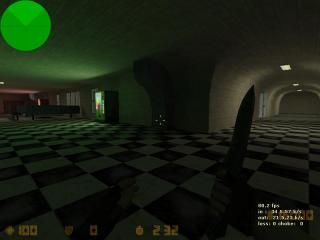
this map is based on the courtyard of my school which turned out to be a lot different than real life, i got some work on the first floor done and did a rough staircase from the first to the second floor
theres not much done but i would like to know what you all think about it and if you think i should finish what ive started
i forgot... dont comment on the skybox because if i finish this map there will NOT be one... and the lighting isnt perm.
3 Comments
You must log in to post a comment. You can login or register a new account.

 CS
CS


+interesting and good architecture
+good detail in some places but
-not enough detail in others
-dark area kind of annoying
-some of the scaling is a bit weird
-a bit more texture variety would be nice. You should make your own or use the counter-strike textures since the half-life ones aren't too good although I think blue-shift uses higher res textures than half-life so you might want to use those.
All in all, your map looks great in some places but bland in others. Also, you seem to have a weird texturing error on the door way to the 2nd floor, I don't know if that bug is what you meant when you talked about the skybox. I would keep working on the map and just test the layout to see if it works with knives.
Exquisite architecture in places:
+Beautifully rounded hallways
+Pillars--not doric but...--awsome!
+Cafeteria tables
+Big-ass easter egg!
Almost eclipsed by some bad in places:
-yikes that diagonal stairway is tough to look at!
-scale is a little big in places
-some other baddies, but I can't remember.
Some other distractions, such as bad lighting in some areas, misaligned textures, and some other misc. things take what could easily be a 5 star map--especially for a KA map!--and bumps it down to 3...
Impeccable work in some areas, and some really nasty, but easlily fixed bad work in others.
3 Stars
i just wanted to see if i could make a decently architectured map and i think i am capable of it so i dont no if i will finish this or not