dm_poisongarden
 HLDM
HLDM
dm_poisongarden
by
Rimrook
Posted 18 years ago2006-01-31 09:46:06 UTC •
Completed •
Half-Life: Deathmatch
- Name
- dm_poisongarden
- By
-
 Rimrook
 - Type
- Map
- Engine
- Goldsource
- Game
- Half-Life: Deathmatch
- Category
- Completed
- Included
- BSP, RMF/VMF
- Created
- 18 years ago2006-01-31 09:46:06 UTC
- Updated
- 5 years ago2019-09-09 20:34:36 UTC
- Views
- 11422
- Downloads
- 2259
- Comments
- 42
- Rating
- 4.82 (17)
- Reviews
- 0
UPDATE 9/9/2019:
• Thank Alberto309 for having all of the original files so this could be reuploaded in full!
• Poison and Healing zones are back in, it was the version he had.
UPDATE: The map was previously hosted at m0px.net but the site went down. So I fixed it up a bit and reuploaded it.
Fixes:
Removed poison, no one liked them.
Removed healing zones, people liked them too much
Damage in the egon pool is survivable
No models, sprites, or too much extra downloading
Re-Vis'd it so lower r_speeds
More even and better lighting
________________________________________
After so much time, effort, and development, it finally made it to the map vault! This map isn't an easy map to run around on, and some of the items are difficult to obtain. Every source file and resource is included in one file right here.
Enjoy!
42 Comments
You must log in to post a comment. You can login or register a new account.


<hits download button several times more than neccisary>
Cant wait - is this your entry for Muzzle's compo?
OH MY GOSH!
OHMYGOSH
OHMYGOSHOMGOSHOHMYGOSH!!!!!!!
WOW!
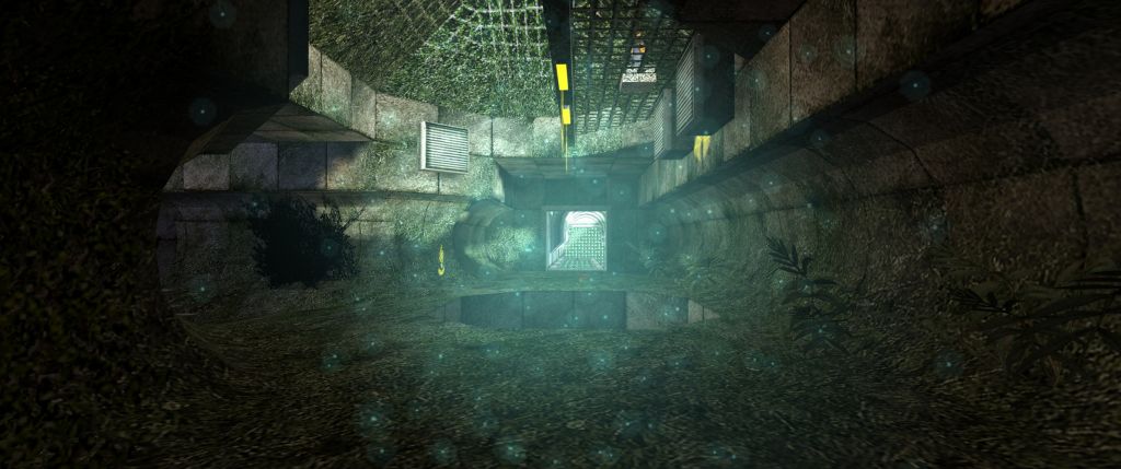
The moment i spawned i knew i was going to enjoy the map, simply by looking at the uber-cool textures, and the great, interesting archiecture!
The textures were AWSOME, and they suited the theme sooo well!
The sprites were great, i mean REALLY great..
The gameplay looked in some places like it would be awsome, but in others, like it wouldn't be so good.. the long tunnel which goes round the map doesn't provide any cover and you could get raped with shotgun from behind.. also, dont try to use the RPG in confined areas
The layout is great, nothing too difficult to figure out, but it still managed to feel like one of your maps rimrook.. doesn;t seem to have and end and that idicates that it will flow beautifully...
Now onto the little details... The room above the RPG is... for lack of better wording - SEX.. like really.. really.. really... sex...
As is the part of the tunnel that sticks out from the main structure, giving thep layer a strange nausiating feeling, and i was rather paranoid at that point, having only just spawned from falling after trying to get the RPG
The egon room is unbelivable.. absolutely indescribable (so i took a screenshot
The healing rings are awsome.. i wanna know how you made them . was it decals?
SPOILERS BEYOND
The RPG floor is.. cool, yet frustrating.. i thought i had finally got over, (having just grabbed the RPG) little did i know that the floor surrounding the raised RPG platform was also breakable.. wheeeee. splunch! (splunch is a great word)
The poison was an interesting take on a DM match... it should make gameplay interesting, with players running to healing rings after getting poisoned, hoping against hope that they wont die after heroicly going for the stronger weapons.
There were a few things i didn't like however.
First, was the ambient light.. in the first room i spawned in, there is a hole in the roof, showing off the sky.. however, there is ambient lights shining down which is far too bright...
Second, was the yellow trim along a panel type thing which travvelled along above the tunnel in one section.. it was just plain yellow...
Well, i think thats it. Once again, awsome map rimrook..
(and another of your maps that i'm gonnah ave to pay child support to
thats the screenshot of the Egon room btw.. its poison in that pool, an evil nemises for those wishing to grab the egon.
btw the word for this is omfgtaculous. officialy.
??Are you trying to atract attention or something??
And @Rimrook,map rocks as usual
About weapons, I figured since a player drops their weapons when fragged, it's not bad to have less weapons. Also, ever think that 1 person will get the egon, then that will get passed on several times. I think it fits the map's hardships. People should be thinking. "This sucks, I love this map!" Since people are becoming bored with even more senseless running around and killboxes.
haven't even downloaded it yet and I already know it's going to be amazing!
However, it didnt feel as epic and awe inspiring as the reflecting room in "Castle Rimrook", "Rimrook Resort" or "Pristine Beach" (my favourite of the lot). I understand these maps were larger and had high r_speeds, but maybe that was part of their charm.
Great map anyway. In HLDM terminology, this would be "datacore" while the other maps are more "crossfire".
heh when you shoot the plants on the walls blood comes out...
poison to safepoints give us expert fraggers an extra challenge rather then just shooting peeps its gonna change the way you play player will have to play more strategically!( get this guy then got to safehealth point ,then go in tunnel see two peeps in poison and your at 80hp- do you goto safe point? slightly engage? or go full out and go for the 2 frags and make it back in time to heal.
This level was cool it serves its purpose i loved the elevator that was a really intuitive way of doing things reminded me of the bad guys base in titan a.e or tron lol will be playing this on the server soon !
Now is it just me or did you place a power pack in the level? If not we will strip mod it and put one in!!!!! 5 stars deffinately with room to spare this is'nt a map that just makes 5 this is a well done map 5+
Way to go Rimrook
now are you going to enter this in competition?
However, in my own personal taste, this is not your best ever work, Rimrook.
But still completely deserving of 5 stars.
I know i can't satisfy EVERYONE's taste in style and appearance. But dang, this IS my best map to my current standards. It performs awsomely AND it looks bitchin' sweet. two things that seem to conflict eachother all of the time for HL1. ciao
Available Again In: 24 days
It will defenitly add this yo my HLDM server.
Very masterfully done.
The only thing that I did not like was all the trigger hurts and I could not see a jump pack.
However all in all it was avery good map!!!!!!
Keep up the good work Rimrook!!!!
Everything basicly has been said, so i'll keep it short:
The map looked awesome. Yet, I wasn't 'loving it' like hunter and others..
I got frustrated a lot in this map, unlike kasperg, it anoyed the crap out of me. The poision is just plain nasty. How can I ever get those weapons in the poision areas? I figured out you could heal at those pillar thingies but still, I died to fastly in the poison.
It rather pissed me off and I stopped playing the map.
Maybe it's just me, but I hated the gameplay.
What can I say? I love brainless shooting wich you mostly do in hl maps.
Maybe you made a 'readme' file in the download wich explained the gameplay in details but like I said. Downloaded from server.
Still, 4 stars.
Don't get me wrong, the map itself HAWT!
At the beginning, I would like to say thank you for including the source files! Did you use Textlights at all? You left out the dm_poisongarden.rad if you did
+Poison sprites look great!
+Excellent Idea with the rotating glyph-thinies
+Weapons platform/glyphs pwn!
+Excellent effect with the obeleisk glow textured down the stairs--exquisite!
+Main circurar room looks amazing!
+Nice Ambients
+Interesting, original layout
-some stuck points in the tunnel--inside part of the turns therein
-neat stuff in the poison areas, but you don't have much time to appreciate them while you're dying
I'm still not sure how I feel 'bout the poison concept. I mean it's definitely original, and cool, but you might consider perhaps lessening the damage or changing it around a bit--godmode turn on!
That nonwithstanding, this is 5-star work all the way in terms of just about every category.
Another superb uber-quality map from Rimrook!
5 Stars
This map kicks ass!
nice map though
http://twhl.co.za/forums.php?pgt=1&action=viewthread&id=10296&pg=2
But when i played it with more people i found out that the map was nothing but good looks. Gameplay isn?t interesting and were ever you go you get hurt, or you get more HP. So it?s VERY easy to get confused, "is someone shooting at me or am i just losing HP?!"
If i only would rate gameplay it would be a 1 or 2 but it?s so damn good looking so it?s a 3 from me.
But it do look sexy... by looks it?s one of the best i've seen, but i wouldn't play it more than that one time i tryed it at school with some friends...
The Glyphs are very neet.
Edit: Thanks for fixing it