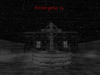
cs_poltergeist2
 CS
CS
cs_poltergeist2
by
Soup Miner
Posted 18 years ago2006-03-11 19:00:35 UTC •
Completed •
Counter-Strike
- Name
- cs_poltergeist2
- By
-
 Soup Miner
 - Type
- Map
- Engine
- Goldsource
- Game
- Counter-Strike
- Category
- Completed
- Included
- BSP
- Created
- 18 years ago2006-03-11 19:00:35 UTC
- Updated
- 16 years ago2008-11-10 03:09:19 UTC
- Views
- 4879
- Downloads
- 1089
- Comments
- 6
- Rating
- 4.33 (3)
- Reviews
- 0
retextured, rebuilt, rehorrified.
Cs_poltergeist2 is everything that cs_poltergeist was not, and then some.
PS: Most of the doors lead to a room now, unlike the orignal map.
Sounds are textures from the mod Afraid of Monsters were used in this map. That game is amazing!
Cs_poltergeist2 is everything that cs_poltergeist was not, and then some.
PS: Most of the doors lead to a room now, unlike the orignal map.
Sounds are textures from the mod Afraid of Monsters were used in this map. That game is amazing!
6 Comments
You must log in to post a comment. You can login or register a new account.


+ Scary as hell
+ A bunch of ambience
+ AoM textures
+ Nice rain effects (scrolling water going down windows, mist blowing around outside)
+ Hostages are spread out
Cons:
- High r_speeds in some areas (around 1500)
- Scale seems a bit off
- Creepy sounds can be tacky/gimmicky after a while
+/- Planty big, although a little too maze-like (you could get in situations where you couldn't find other players)
I never played the first cs_poltergeist, so I can't really compare them and say this is a major improvement, but I still think it's a really great map.
The basement area was really creepy, and the whole map had lots of atmosphere to it.
The only thing I could really suggest (that you could realistically change at this point) is to make the scale better. The doors, and lots of smaller items were way too big.
One thing I must say is that some of the additional textures and detail items look really good, and make the house more realistic. And though the detail is well done, some areas are lacking in it a bit--like the main front hall. I can hardly blame you for that though, because the r_speeds are in the 1300's already at the worst spots.
Besides the new/imrpoved detail and textures, the basic layout is the same afaik. I think that beautiful detail work and textures would be much better used on an smaller and less confusing layout.
I miss the blood pools! Yeah, they weren't realisic but they were cool! Their shape just needed to be varied a bit imo--in the original.
Last gripe is that I think it's way too dark in many places. I understand darkness fits the theme here, but if it's too dark it sort of defeats the purpose in terms of gameplay, imo.
Great improvements!
*********************
+ Architecture. The rooms, outside areas were all very well-made. I liked the props/furniture, etc. It was all really great. The corridors weren't too repetative, because of the great architecture and detail. The stairs in the main room with the jesus statue could have railings, although if you've skipped them due to the high r_speeds in the area, I understand.
+ Texturing. Superb work. The worn-off plaster textures in the corridors, the wood textures, the paintings, etc. It was all great.
+ Ambience. The.Best... ever. From the wind sounds to the fake footsteps in the library (great touch). It was perfect.
*****************
+/- Layout. It wasn't too complex, although some directions would have been nice.
****************
- Gameplay. Here start the cons. Now I understand that you had to keep the atmosphere as scaryas possible, although still - this map is just TOO DARK for mp. The layout isn't too complex, although the split up hostages make the gameplay a bit T-balanced (they can't hostage camp, though).
******************
Overall - the spookiest map for CS, I've seen yet. If it was SP - i'd give it 5 stars, without doubt, although it's MP and MP maps depend much on gameplay, not only good looks and atmosphere. And the gameplay wasn't the map's strong part. 4*.