cs_miami
 CSS
CSS
cs_miami
by
Xyos212
Posted 18 years ago2006-03-28 23:48:48 UTC •
Completed •
Counter-Strike: Source
- Name
- cs_miami
- By
-
 Xyos212
 - Type
- Map
- Engine
- Source
- Game
- Counter-Strike: Source
- Category
- Completed
- Included
- BSP
- Created
- 18 years ago2006-03-28 23:48:48 UTC
- Updated
- 18 years ago2006-03-29 03:12:56 UTC
- Views
- 7858
- Downloads
- 1707
- Comments
- 14
- Rating
- 4.33 (3)
- Reviews
- 0
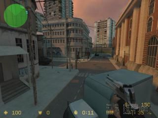
This is a recreation of the popular map cs_miami from Counter-Strike on the xbox. It?s graphically revamped and custom built to match the format of the original, but with an innovative source element.
Myself and by brother (Exos) created this map. Alot of time and effort went into this map. It is bot compatible, (very well I might add) custom textures bsp zipped into it, and sounds. There are some Easter Eggs as well :)Please give me and my brother your honest opinion about the map.
Please dont judge by screen. There is MUCH of the map not visible!
14 Comments
You must log in to post a comment. You can login or register a new account.


Email me the file and I'll host it up on my server instead.
http://twhl.co.za/mapvault_map.php?id=3806&dl=1
I wish map vault had edit button
I'm sorry that I won't be able to playtest this because I don't have HL2 installed at all
Looks great from screeneh
Its only a personal opinion, but I dont really like the textures used inside. The wall textures get a bit repetitive, and the wood floor textures (are they official?) are way too shiny...
There are occasional bot pathway issues (trying to walk thru a wall and jumping, or even trying to shoot thru a wall) but this is highly rare. I found also at thimes the area was slightly underlit, and i couldnt tell friend from foe.
All in all, i feel that the level is great: custom textures, great world detail, and fair for both teams
Few things that left me bother were the lightning of the vents since there were no actual source of lights so the light just came out of nowhere. Of course this might have been just a gameplay thing to eliminate nasty shadows from campers but in my opinion light should always have a source.
The second was that I had some hard time to get hostages out of the building near the main entrance to the right where this room leads to another corridor was really pain in the ass! Well this has been an issue in my maps too so don't sweat it
Overall excellent job in brushwork, textures, props, detail ect. and a very playable map with both teams!