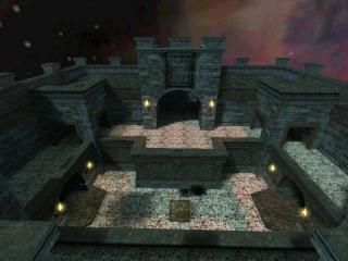
Double_Trouble
 HLDM
HLDM
Double_Trouble
by
Orpheus
Posted 18 years ago2006-05-08 18:22:13 UTC •
Completed •
Half-Life: Deathmatch
- Name
- Double_Trouble
- By
-
 Orpheus
 - Type
- Map
- Engine
- Goldsource
- Game
- Half-Life: Deathmatch
- Category
- Completed
- Included
- BSP
- Created
- 18 years ago2006-05-08 18:22:13 UTC
- Updated
- 18 years ago2006-05-09 14:30:24 UTC
- Views
- 1842
- Downloads
- 749
- Comments
- 3
- Rating
- 3.50 (2)
- Reviews
- 0
... My 9th and final release for Half-Life 1 (Released: October 2002)
This map was created for the Snarkpit mapping competition, or at least one of them
The concept of the mapping tournament was "Opposing themes". This map combines rather well the ideas of space age with medieval.
This map was created for the Snarkpit mapping competition, or at least one of them

The concept of the mapping tournament was "Opposing themes". This map combines rather well the ideas of space age with medieval.
3 Comments
You must log in to post a comment. You can login or register a new account.


+ Archetecture, very convincing of a 12th century castle.
+ Textures, well done and not too squishy this time.
+ Items and such were in good order.
+ The round hallway.
= I've seen better light in your 8th release.
= Could have mixed your two themes better. Just having seperate rooms with seperate themes doesn't quite impress me. Unless this is what the compo rules were.
- Annyoing echo in the courtyard. It should be a bright reverb, or no reverb at all. Think of your surroundings more when adding these effects and how sound really would bounce off of them.
- Ladders. nicely built, but the instant thing was weird.
- OK layout. If the under area was all tech and the upper part was castle, that'd be a good mix, or place computer consoles in the lower part to mix it up even more. Maybe elevators instead of ladders, players tend to like quick elevators more anyway.
Once again, polish it off. Take in constructive criticism but pick what you want to change based on it.
Thanx for looking.
(about the ladder. I didn't want a tinny metal sound associated with a wooden ladder so I built a series of clip brushes that were 1 unit wide and something or other tall. There are about 15 clips in that set. The walking up the ladder is disconcerting because HL1 is always set to run, so you are basically running up the ladder. You only walked with the default HL1 ladder entity.)
I forgot to ask, no one noticed how well the song fit the theme? It, IMO, set the mood for the map and it enhanced the fragging.
Gave it a Doomish feel.
maybe no where near as much as Rimrook or Kasberg, but skill. then again you made this in 2002, so I really can't say.
everything rimrook said but 4*'s