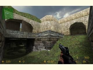
de_inca

Counter-Strike: Source CSS
de_inca by Tetsu0
Posted 18 years ago2006-05-10 21:12:14 UTC • Completed • Counter-Strike: Source
Loading...
Screenshot Thumbnail
Name
de_inca
By
Tetsu0 Tetsu0
Type
Map
Engine
Source
Game
Counter-Strike: Source
Category
Completed
Included
BSP
Created
18 years ago2006-05-10 21:12:14 UTC
Updated
17 years ago2007-04-01 05:11:14 UTC
Views
5733
Downloads
1033
Comments
9
Reviews
0
Download

de_inca -- V 2.1 BETA
Inspiration was drawn from both de_dust and de_aztec to create this defusal map. Players will have too keep on their toes due to many wide spaced areas, and vertical gameplay.

I will make changes/ additions based upon your reviews and/or forum posts. Notice its a beta, but technically, the map IS complete.

UPDATES::
Well i ported it to source. It only took me a year. Once again, i playtested it a bunch with the kids from my floor in my dorm so the layout was adjusted for team equality. Map still favors the terrorists a bit, but some maps do. I'm still working on the skybox, and this version only had a fast compile but i think it's about time people knew i updated this as i said i would.

another update soon hopefully

9 Comments

Commented 18 years ago2006-05-10 21:50:23 UTC Comment #11759
Just looking at the screen, perhaps you should have waited for more inspiration. Then again, screens are misleading.

shrugs
Commented 18 years ago2006-05-11 02:12:18 UTC Comment #11760
Hate to say it, but I think you forgot to wadinclude the HL2 textures again ;) I can still play it though, I've got that WAD
Commented 18 years ago2006-05-11 03:03:23 UTC Comment #11761
Ok, here's a list of things to improve.
  • Get a new skybox. Look around on Wadfather for a new one, or just use one that came with CS (those are plenty good for this application). That desert theme really doesn't compliment it well at all.
  • I would upscale the ground texture just a bit so it doesn't look too repetitive, and you'd save some w_polys too. This will help alot if you add more detail...
  • Add more detail! There is little or no detail at all in the entire map, aside from the broken bridge thing and the curved stair trim (which I would barely consider detail). Put some stuff like grass sprites, signs of a dig going on (is there one?) or more decay. Hell, even a couple of crates would look good at this point. It feels way too bare.
  • Put more effort into the texturing, maybe even getting some other ones that aren't included in the HL2 WAD (some of those just don't fit). I also noticed a lot of texture misalignments on the arches. Maybe you could replace those parts with new textures?
  • Add a bomb site decal to the bomb spot.
  • More cover. You can still have the wide open approach without making it an AWP-fest.
  • The slope down to the water is too sharp, and doesn't look natural. Maybe make the slope more gradual? I can't really place my finger on why it doesn't look right.
  • I didn't notice any ambience. Get some birds or cricket sounds in there, or anything else that sounds right.
  • It needs some landmarks. I had a hard time finding my way around. Putting some detail in should clear that up.
This shows promise, and the layout is good, but you don't have much more than the base map down at this point.
Commented 18 years ago2006-05-11 04:15:39 UTC Comment #11762
Erm, a few more things:
  • You could make the flat, boring, ground mor einteresting if you made some terrain on it. Nothing fancy, just put some slopes here and there on top of what already exists
  • Make the start locations more interesting. As it is, you can't tell them apart from the rest of the map.
  • angle the walls back a little in places to give some variation in them.
  • Put more supports under and around bridge bomb site. It looks really unrealistic the way those walkways are just hanging there.
I just noticed that you did put those leaves hanging down, which accounts for some detail. Put more stuff like that in and it could be great.
Commented 18 years ago2006-05-11 12:41:06 UTC Comment #11768
I still don't have the HL2 wad, so I can't open it right now:

"WARNING: Could not open Halflife2.wad"
Commented 18 years ago2006-05-11 15:49:11 UTC Comment #11772
take the HL2 textures you used and put them in their own .wad
Commented 18 years ago2006-05-11 17:02:32 UTC Comment #11773
Or just -wadinclude them, as most do...
Commented 18 years ago2006-05-11 18:07:02 UTC Comment #11775
i dont understand why the -wadinclude isnt working, but ill definityly make sure after the next update. see this is the critique i needed.. tnx guys
Commented 17 years ago2007-04-01 05:14:30 UTC Comment #14544
SOURCE COMMENTS START BELOW THIS LINE =]

You must log in to post a comment. You can login or register a new account.