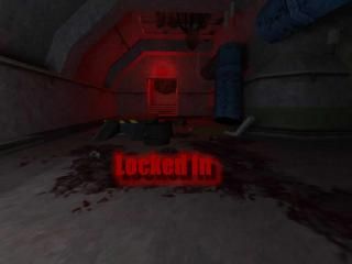
This is my compo20 entry. I used mostly horror effects and didnt allow much destructification. Anyway, I had fun making this map. And thats what makes it valuable to upload it in the map vault.
Commented 18 years ago2006-05-12 12:00:03 UTCComment #11790
This has some REALLY cool effects.. Really, really well made effects. Very FEAR-esque. But the aim of the compo was to have a post-disaster version of the base map, and lack of noticable destructification really ruins it for me...
I wont rate because i'm not sure what i thought... Effects were awsome...
But it was just like you'd made effects and stuck them in Kasperg's map.
Commented 18 years ago2006-05-12 12:02:03 UTCComment #11791
haha, awsome.. I liked the way you coordinated this entry.. plus with my key-binding to always walk, I slowly walfked through it, and it was great.. Loved the camera effects...
Commented 18 years ago2006-05-12 13:36:36 UTCComment #11801
I liked it. The atmosphere was nice and the camera effects were superb, combined with the quick fades and sounds it looked amazing. The exploding generator-thingies were a good addition, aswell.
I loved the hung scientist, heh.
But, it really does deviate from the competition goal - nothing was destructified. I'm going to rate it as a standalone map, having nothing to do with the competition.
One thing you could change would be the lighting - it was very contrasty, made it hard to see some places, IE one spot was completely black and the area next to it flooded with light. 3 stars. Nice work.
Commented 18 years ago2006-05-12 16:45:07 UTCComment #11813
++Superb cutscent/clairvoyant concept, and superbly implemented! Kudos/points for origniality :P!
++Excellent use of sprites/lighting to achieve beautiful vistas. Very subtle, beautiful work.
++Great ambience.
++Great Destructification where you could find it. Besides some of the vistas like the steam/fire venting, the fire door looked great too. The sprite/lighting by the skeleton at the end looked amazing too!
Other debris and destruction you had was also nice, you just needed more imo.
Commented 18 years ago2006-05-14 17:09:41 UTCComment #11849
I liked this map. Great ambience! Good use of sounds also, I was spooked while making my way through. I really liked the clairvoyant camera work. I liked the sprite/laser circle too. Good work.
I wont rate because i'm not sure what i thought... Effects were awsome...
But it was just like you'd made effects and stuck them in Kasperg's map.
Hard to explain how i feel about this
I loved the hung scientist, heh.
But, it really does deviate from the competition goal - nothing was destructified. I'm going to rate it as a standalone map, having nothing to do with the competition.
One thing you could change would be the lighting - it was very contrasty, made it hard to see some places, IE one spot was completely black and the area next to it flooded with light.
3 stars. Nice work.
Help?
Creeeepy...
++Excellent use of sprites/lighting to achieve beautiful vistas. Very subtle, beautiful work.
++Great ambience.
++Great Destructification where you could find it. Besides some of the vistas like the steam/fire venting, the fire door looked great too. The sprite/lighting by the skeleton at the end looked amazing too!
Other debris and destruction you had was also nice, you just needed more imo.
Excellent work!