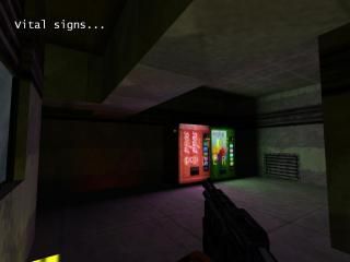
Vital Signs
Hey.
This is my first submitted map really. I started working on it quite a while ago, but kind of lost interest after a while. Then I restarted because I just really wanted to finish it...so I guess I didn't put 100% effort into this map.
This map is meant to be a fun little single player experience, it isn't boasting great texturing, architecture or storyline, though I would like to think it was at least acceptable in all respects.
So anyway, hope you enjoy this, and constructive critisism is welcome, though to be honest Iam unlikely to work on this map any more, but I can take it onboard for any other mapping projects.

32 Comments
You must log in to post a comment. You can login or register a new account.

 HL
HL


I'll download and give it a whirl
Quite nice Architecture and texturing, and pwn use of decals to really make a room look great--numbers and streed decals looked pwn on those doors at the beginning!
Lighting is a little dark for my taste, but I suppose it's part of the theme.
Gameplay is fun, and not too hard, but a few things I didn't like:
-In the crate room, it was unclear to me that you had to break that meatal grid to go into the floor, and I roamed around in that room for a long time pointlessly tryint to jump on boxes. This illustrates one of the 2 mistakes--well, imo anyway :)--I see for breakables a lot:
1. Their health is set way too high.
2. It's unclear that they're breakable, because of the material they're made out of. I usually try to make breakables out of really "weak-looking" materias, so it's apparent they're so. Also in the third to last room, you have the valves blocked by the same material, but now it isn't breakable--inconsistent!
lso, if the lighting was brighter, or if you put a subtle water ambient sound by there, it also would of been a nice clue .
++The architecture in the second to last room was amazing!
Very nice work!
A
I have taken those points into consideration for any other maps. I guess their hp where pretty high, and it was a bit uncertain as what to do.
Don't let this map be your last!
But none the less, I'll take that point on board.
Cheers
i'l download it later on when im back.
And good man, tell all your friends. ^_^
If you want dark maps, try leaving it dark, but add in bright points of light around key areas. This also adds drama, and even tension if the light is flickering.
it was fun, i thought there was a secret above the room with the houndeyes and the crates, but i guess not. I tried jumping up there.
Personally I thought the lighting was fine. But when you have made something you rarely see all the faults.
I made the map quite dark because I wanted to emphasise the texture lighting, which I was quite impressed with at the time, since I only learnt to do it on this map.
And I tried to put the lights in key places to lighten the map up in certain areas, but also leave it quite dark.
Since every one seems to be against the dark, I guess next map will be brighter, now you all have to wait another 903 days for the next one ;D
I do not believe in 1's unless the map was total shit. I do not believe in 5's because no one makes maps that good. Tis why I opted to promote a 10/10 rating system it leaves a lot of room between a 9/10 map and a 10/10 one.
Anyways, this is not a 1 map.
I score it a 2.
Anyway..
Anyway, what exactly was wrong with it?
How can I improve?
I do not rate people by feelings. I rate them by their achievements.
To be honest, without a 10/10 rating system, its truly difficult to give an honest opinion because it only leaves 3 numbers you can really use.
very few maps are truly 1's, and there can never really be a 5 because that signifies perfectly made so we are left with 2,3 and 4.
Anyways, get to know me.. You'll be surprised methinks.
I suspect that you got spammed by your attitude, more than anything else but, I don't care about attitudes.
And Orpheus, I am not completely sure what you mean...But in the past I have seen many great maps being spammed 1 star becuase a person doesn't like them.
If you look in the vault at some maps, you'll see 2 downloads and fifteen 1 star ratings. That is why I disabled the rating.
But Orpheus, what could I improve in this or future maps to make it say..a 3 star, or even a 4 star map then?
What could you do? I dunno what you did, or didn't do while making this one so how can I possibly answer?
My only bit of advice is get as much feedback as you can stomach. If this site doesn't give you what you need seek it elsewhere too.
I have been trying to get as many comments as possible, and pretty much all of them have been about lighting, so I shall try to make future maps lighter.
And I was going to submit my map on Snarkpit, but I found it to be slightly uhh..unweildy. I couldn't find anywhere to submit a map. I went to the maps page, where it would be logically, but I couldn't find anything. But I am not really bothered now, I might try and submit my next map there though.
The site has been fine tuned so much that is appears complicated until you see the simplicity. Everything you have the power to control is in your control panel.
As far as feedback goes, Snarkpit will push you to your limits. If it is within you to succeed, you will. If not...
But I might submit maps in the future now I know where to. ;D
No sarcasm or humor intended.