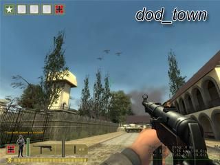
dod_town
 DODS
DODS
dod_town
by
Exos
Posted 18 years ago2006-05-22 15:50:30 UTC •
Completed •
Day of Defeat: Source
- Name
- dod_town
- By
-
 Exos
Exos - Type
- Map
- Engine
- Source
- Game
- Day of Defeat: Source
- Category
- Completed
- Included
- BSP
- Created
- 18 years ago2006-05-22 15:50:30 UTC
- Updated
- 18 years ago2006-05-22 15:50:30 UTC
- Views
- 2162
- Downloads
- 721
- Comments
- 8
- Rating
- 5.00 (1)
- Reviews
- 0
It is done! This DOD Source map is a town with a huge church in the middle. Check it out!
8 Comments
You must log in to post a comment. You can login or register a new account.


The church lighting inside was very well done, and looked great.
The planes and 3d skybox was very well done.
The HDR lighting was great too.
Very big, and open for good battles.
I liked the fade in outs in doorways and windows hiding the area
portals for increased FPS.
Very good use of displacements.
Cons: Some buildings were too plain. Some areas were too open.
Texture detail in areas was too plain.
Other: Its a very big map. I can see the work that went into it. I really liked the planes, and the bird flying around.
Good FPS for such a big open map.
Well done.
Looked good in the video but since I don't play DoD that much I won't test it...Looks good in the pictures anyway.
As for the map, I suppose I should break down and buy DOD, I have seen some quality screens for it of late.
You wouldn't have any other screens of this map handy? Preferably, 56k friendly ones. I would like to see more.
Long list of dead Tinypics links removed
Yes they are the same screens from that movie I made, but at least you don't have to download the movie to see them.
sighs
Thanx anyway. Its my problem, not yours. I did look at the 1st link but they are just to massive to be worth dedicating an hour to.