Gaussfobia
 HLDM
HLDM
Gaussfobia
by
MaMuS
Posted 18 years ago2006-06-04 21:19:03 UTC •
Completed •
Half-Life: Deathmatch
- Name
- Gaussfobia
- By
-
 MaMuS
MaMuS - Type
- Map
- Engine
- Goldsource
- Game
- Half-Life: Deathmatch
- Category
- Completed
- Included
- BSP
- Created
- 18 years ago2006-06-04 21:19:03 UTC
- Updated
- 17 years ago2007-12-23 19:25:14 UTC
- Views
- 2722
- Downloads
- 940
- Comments
- 4
- Rating
- 4.00 (1)
- Reviews
- 0
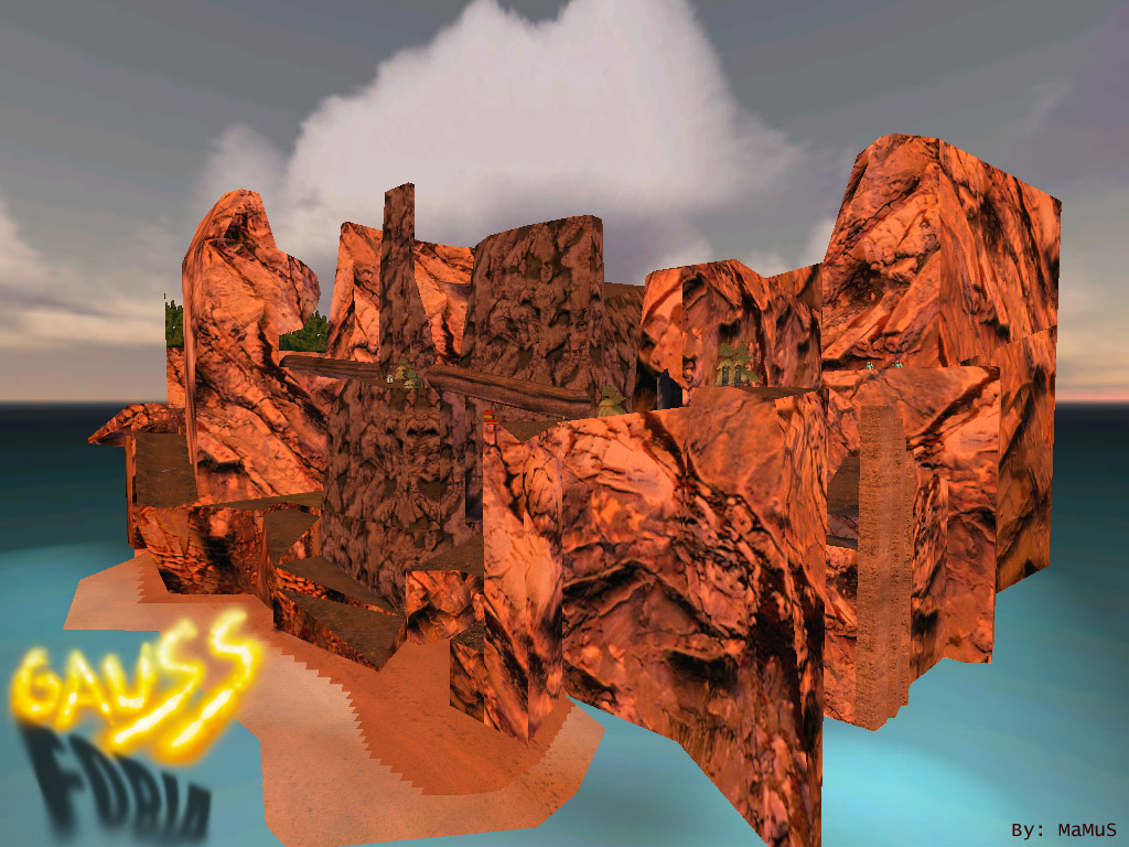
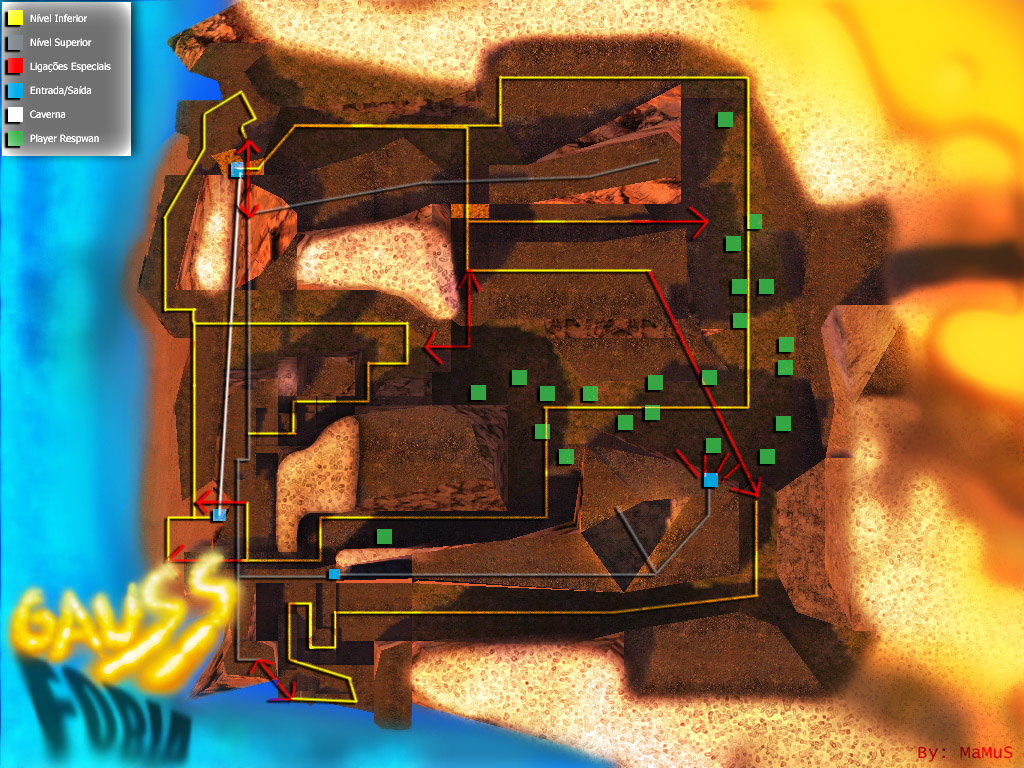
A Death Match map where the player's start all in one point of the map:
The map is imaginary divided into two parts, the low and the high.
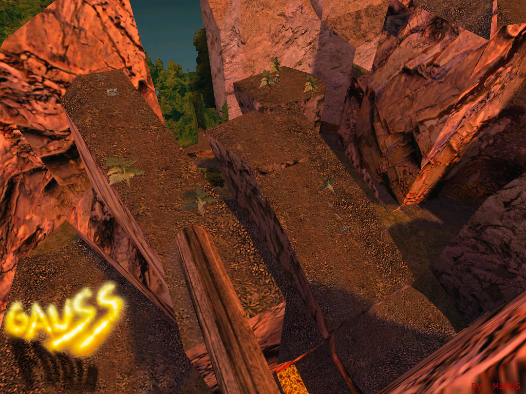
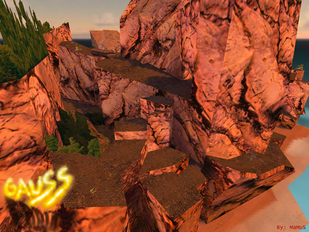
The high part is the best one, where you can find the two gauss and crossbows.
The low part has some weapons like rockets, shotguns, grenades, tripmines... and, is where the players respawn.
After all, who acquires a gauss will have the best locomotion trough the map, because it's has an extreme deformed terrain, with cliffs and mountains. Ex:
That's it. This is a Medium map, with some more surprises.
Overview:
4 Comments
You must log in to post a comment. You can login or register a new account.


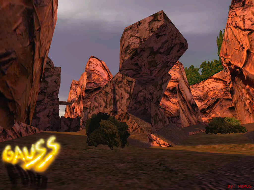
But i kept getting stuck on the rocks quite often. clip brush some to simplify them.
Overall, a very nice map. 4 stars from meh.
I like how you blended the sky with the terrain, and although it has some issues--water doesn't look too "watery", and you can see the lava underneath--, it's still very nice.
Terrain is excellent. Varying it with foliage and small props was a nice touch too. Texturing is ok at best though...that redstone became very painful to eyes after a while, and looked unnaturally red--were the rocks textlights, was the lava light bleeding through, or was i just the texture?
Different ambients for different parts of the map was nice, as well the "deathcry" you hear when you fall off the cliff :)!
Lava area was great and nice ambients there too, though I would vary the textues a little there too to make it a little more interesting--add some black textured stalactites perhaps, add some crystals...somethign to break it up a little. Lava flows looked great!
I have to go negative on the layout too. I walked around for a long time, with still no really good idea of the place. I would try to simplify it a bit.
I liked the volumetric light in the upper cave...very nice effect!
And finally, excellent original theme for HLDM, nicely pulled off I would say.
Good Work!
"But i kept getting stuck on the rocks quite often. clip brush some to simplify them."
I think that those clipping problems are not so bad.. When the map was in development I was having some problems with that.. but now I'm accustomed.
"I like how you blended the sky with the terrain, and although it has some issues--water doesn't look too "watery", and you can see the lava underneath--, it's still very nice"
Yes.. the water is very crappy, I'm tryng to do something better in my next map, but that is it for now.:P
"Terrain is excellent. Varying it with foliage and small props was a nice touch too. Texturing is ok at best though...that redstone became very painful to eyes after a while, and looked unnaturally red--were the rocks textlights, was the lava light bleeding through, or was i just the texture?"
About the rock textures.. this was the effect's that I just wanted to add, a strong sun light, but yes, it could be less orange.
"Lava area was great and nice ambients there too, though I would vary the textues a little there too to make it a little more interesting--add some black textured stalactites perhaps, add some crystals...somethign to break it up a little. Lava flows looked great!"
Yea.. the lava part was implemented at the end of the project and it is a little "raw" I would say.. I wanted to do something bigger, but there were no space (I would need to put it deeper to get some space). That come's just like a suvenier
Is anybody hoping to play this on a server?