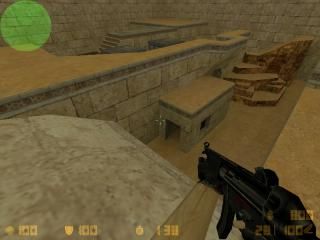
Air fire
- Name
- Air fire
- By
-
 S3rius
 - Type
- Map
- Engine
- Goldsource
- Game
- Counter-Strike
- Category
- Completed
- Included
- BSP
- Created
- 18 years ago2006-06-07 13:41:56 UTC
- Updated
- 18 years ago2006-10-06 22:35:52 UTC
- Views
- 1805
- Downloads
- 644
- Comments
- 10
- Rating
- 5.00 (1)
- Reviews
- 0
Another CS map
10 Comments
You must log in to post a comment. You can login or register a new account.

 CS
CS


(Removed non-English replies)
+weapons crates
+Nice architecture, relief, and layout.
-could use more props, detail items--though that mini sloped rock formation looked quite nice!
+Nice enough lighting, (add some fixtures in some the dark rooms though)
-no ambients
Not providing a decent discription leads to a warning, and eventually lead to deletion of the map when it happend again.
I was overreacting a bit i geuss. Sorry. But a decent map discription for the completed maps is a must have.
The first con would be the amazingly low r_speeds for such an open map with a very decent ammount of detail. The highest r_speeds were ~1080 wpolies and that's quite acceptable.
I also liked the custom trims/texturing of the map. They added a cutsom and newer feel to the whole map (most other aim maps don't use any custom material).
The architecture was quite good for an average map and amazing for an aim_ map. The arches, cliffs were quite detailed and good-looking.
The gameplay should be good, since there are multiple levels of combat and a quite interesting layout (layout in an aim map?! :o). That should provide the map with smooth and fast-paced gameplay.
The cons would be the lack of ambience and the sky not fitting the lighting. No matter, how csgeeks hate ambience and flame the mapper about that - there really should be at least some in every map.
And I didn't like the night sky in a bright map. Use a daytime sky for more realism and better looks.
Overall - the map is very well-built for an aim_map and compared to others - it's v. beautiful. Great work!