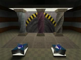
Twisted Pillars
lol, from the "Sweet Mother Of God" thread.
They're not perfect, but I think they're pretty decent.
2 things I learned from making this example:
1. The columns looked terrible until I selected all the faces of each one, opened "texture properties" and hit "fit". They looked so bad before doing that, I almost gave up
2. Though this example doesn't really serve anything paticularly practical, it was a great exercise. I learned a new way to manuver spikes that is easier shown in the .rmf than I can explain.
Anybody taking a look at the example should be able to reproduce the columns. The only tricky part is keeping track of each layer's verticies--I grouped each layer together, and textured each face differently, to better keep track of the 12 brushes per layer.
The only other tricky thing, is after rotating each piece into place, you have to layer-by-layer, align the verticies. They don't line up with perfect symmetry--I tried and tried for that--, but they line up well enough that you can't really tell.
HAPPY MAPPING!
Any questions, feel free to PM me.
They're not perfect, but I think they're pretty decent.
2 things I learned from making this example:
1. The columns looked terrible until I selected all the faces of each one, opened "texture properties" and hit "fit". They looked so bad before doing that, I almost gave up

2. Though this example doesn't really serve anything paticularly practical, it was a great exercise. I learned a new way to manuver spikes that is easier shown in the .rmf than I can explain.
Anybody taking a look at the example should be able to reproduce the columns. The only tricky part is keeping track of each layer's verticies--I grouped each layer together, and textured each face differently, to better keep track of the 12 brushes per layer.
The only other tricky thing, is after rotating each piece into place, you have to layer-by-layer, align the verticies. They don't line up with perfect symmetry--I tried and tried for that--, but they line up well enough that you can't really tell.
HAPPY MAPPING!
Any questions, feel free to PM me.
3 Comments
You must log in to post a comment. You can login or register a new account.

 HL
HL


Your method is actually quite different, and much easier than mine. In mine, each "piece" is made out of 3 seperate brushes, and they bend different ways.
Your method is much cleaner and perfectly symmetrical, but the finished product doesn't really look like Skarrj's columns.
Besides, VOX completed his before you, so HE wins the internet!
^__^