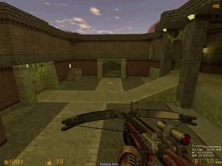
xdm_dream
 HLDM
HLDM
xdm_dream
by
rend0us
Posted 18 years ago2006-07-24 17:24:47 UTC •
Completed •
Half-Life: Deathmatch
- Name
- xdm_dream
- By
-
 rend0us
 - Type
- Map
- Engine
- Goldsource
- Game
- Half-Life: Deathmatch
- Category
- Completed
- Included
- BSP
- Created
- 18 years ago2006-07-24 17:24:47 UTC
- Updated
- 18 years ago2006-07-24 19:43:29 UTC
- Views
- 2199
- Downloads
- 814
- Comments
- 5
- Reviews
- 0
xdm_dream - smooth for fighting, built from scratch, let me know how it's liked or disliked
www.addcrue.com register today
www.addcrue.com register today

5 Comments
You must log in to post a comment. You can login or register a new account.


If so - tag it properly
I like the detail items like the lamps, the tiles and some other stuff. The chair models are scaled a little too big.
Nice triggerable ambients--bird sound by the door. Were there more?
The env_sound was a little wearing on the ears, and some volumetric light would have looked really nice in the "skylight" room.
Not your best work, but still a pretty decent dm, and it looks like the layout/weapon placement would be good.
BTW, are you Saribous' alter ego?
Nice map!
/nitpick
new link