Map Number 73
 HL
HL
Map Number 73
by
worldcraft20
Posted 18 years ago2006-09-23 05:22:12 UTC •
Unfinished •
Half-Life
- Name
- Map Number 73
- By
-
 worldcraft20
 - Type
- Map
- Engine
- Goldsource
- Game
- Half-Life
- Category
- Unfinished
- Included
- BSP
- Created
- 18 years ago2006-09-23 05:22:12 UTC
- Updated
- 18 years ago2006-09-23 05:22:12 UTC
- Views
- 1773
- Downloads
- 644
- Comments
- 6
- Rating
- 3.00 (2)
Map Number 73:
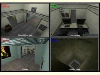
Based on the tutorial from In The Beginning, this one had only a small improvement: the office in the other side, and an elevator in the main side. Also, a nice looking Flourescent Light fixture is shining at all sides.
Based on the tutorial from In The Beginning, this one had only a small improvement: the office in the other side, and an elevator in the main side. Also, a nice looking Flourescent Light fixture is shining at all sides.
6 Comments
You must log in to post a comment. You can login or register a new account.


Never heard of it.
@Worldcraft20: Your map was actually pretty decent for a first map...at least, better than my attempt, which looked like crap. One thing I suggest is to make the buttons a lot smaller, and maybe add a little more architecture. I'm not an expert on mapping, so I really can't say much more.
One thing though is that the shot from the Monster House movie in the elevator felt out of place. Would've looked better in the office or hallway.
I'd recommend expanding on this map. Make the rooms a bit less cramped, minimize some things a bit, add some more sections.
But I haven't looked at those tuts in what like a year.
I'll have to take a look.
I noticed the back of the shelves were in the wall move them forward, Lift door were flawed as they moved up to far when going up.... I wouldn't know how to fix it because I've never done a lift like that.
Its better then my first map, Good job. 3 because its your first map.
Looking good worldcraft20.
Detailing the outer part of the elevator shaft would make the elevator ride look that much pwner, and making the little bit of architecture you have showing a little more sleek and defined--less blocky.
Good work, keep it up