Just another lab
- Name
- Just another lab
- By
-
 Ansith
 - Type
- Map
- Engine
- Goldsource
- Game
- Half-Life
- Category
- Unfinished
- Included
- BSP
- Created
- 18 years ago2006-10-17 08:28:38 UTC
- Updated
- 17 years ago2007-04-09 03:25:19 UTC
- Views
- 5764
- Downloads
- 1144
- Comments
- 9
- Rating
- 4.00 (5)
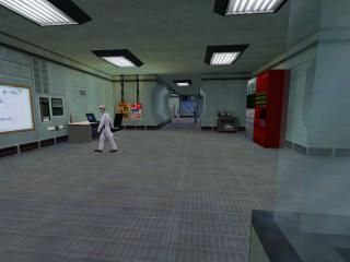
Another Lab map, Well just the start of one. Small, but I still want to know how I'm doing with it. Its going to change from Pre-disaster soon.
Anyway, if you see any problems please tell me, and if you would Rate and comment.
Thanks.
Updated. 09/04/07
Anyway, if you see any problems please tell me, and if you would Rate and comment.
Thanks.
Updated. 09/04/07
9 Comments
You must log in to post a comment. You can login or register a new account.

 HL
HL


The only negative things I could find about it were quite subtle, and they may only be a matter of opinion. For instance, there seem to be too many security guards for such a small area, and I would personally change the ceiling texture to something less bland, such as the one used in the original lab environments.
You also might want to null all the faces on the glass chambers, except the ones that are facing the room, so they don't look weird when the see the corners from the side. You can even see an example of this in your screenshot.
Overall, a pretty neat map, but it could definitely use some expanding.
You've certainly improved your mapping skills.
The first 2 rooms were really nice and the small sequences were a great touch, then after these 2 rooms, it became really bland, I guess you need to work on those..
I liked the small gman scenary, always does the trick.
Anyway, I do think you need to improve on the ceiling, true the whole map the ceiling was really really bland, same texture all over again with those big bad (slightly unneccasery, those give quite some light you know, you got 4 in 1 room, I think you could lesser them to 2 and then some other ceiling detail) lights. I would also use create some difference between the textures, ofcourse it's a lab, but you had the same floor and ceiling textures all over the map, even the lab textures got some difference between them.
I'm going with a 3, but with a bit more work, it'll be a 4 anytime soon.
You got some nice scripted sequences there. But the walls, floors and ceillings are a bit bland. Add some trims, more grating, and some height differences. I like your airducts though.
+good scritping--random?
+good use of ambients
+competent but boring textures
+Nice but boring, standard HL architecture
+decent detail, but you could use more detail work and props imo
Nice work, but if your going to do BM, why not give it a new, or spiced up slant with some fresh architecture and textures--or use of the textures at least... you're not really covering any ground that hasn't already been covered thousands of times before