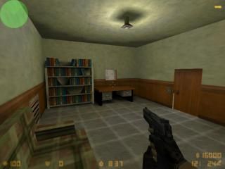
cs_secretwarehouse
 CS
CS
cs_secretwarehouse
by
kiLLjoy
Posted 18 years ago2006-12-08 02:49:47 UTC •
Unfinished •
Counter-Strike
This is my first map so please be kind  . Its not finished and im going to add another way to get to the spawns other than the tiny little grate, or else it would just be stupid. Theres one problem, if i press the light switch it dissapears and when i press it again it comes back, any help??
Remember to shoot the grate and please tell me if i zipped it right.
Requirements:
aes.wad (comes with .zip | goes in cstrike folder)
 . Its not finished and im going to add another way to get to the spawns other than the tiny little grate, or else it would just be stupid. Theres one problem, if i press the light switch it dissapears and when i press it again it comes back, any help??
 Remember to shoot the grate and please tell me if i zipped it right.
Requirements:
aes.wad (comes with .zip | goes in cstrike folder)
8 Comments
You must log in to post a comment. You can login or register a new account.


It looks alright for a first map.
ill add it to the zip now and upload it again
Brushwork looks fine throughout, and you even added lights--My first few maps had none!
Your texture alignment/application/choice is something else though
Texturing is a little weird at first--I still dont really understand "face" or "world" lol, but you get better the more you use it. A couple of tips I can think of:
?when scaling the texture, set the x and y values--under the Face Properties window(shift-a)--to what is listed under "Size". (also in face properties.) In most all cases, the size is also the intended scale for the texture.
?Use the "Justify" buttons also under face properties. They are very useful, and will make your texturing life much easier. For the most part, don't use the "fit" button until you know more what you're doing.
?If a texture looks funny, even after all this stuff, try checking the "Face" box for the heck of it. Sometimes that's all you have to do, but I must admit, I dunno why.
?Clicking the "Hide Mask" button makes darker textures easier to see. Use the mask to make bright textures easier to see.
?If you like the way the texturing on one wall looks and you want to transplant those exact settings to another wall: select the texture and while holding the ALT button down, RIGHT-CLICK the wall you want to look the same.
Once again, the more you play around with these options, the better you'll get. Don't be afraid to try new stuff... it could make your mapping life much easier
thanks once again